Extract Differences by Synthesizing Two Satellite Images Taken at Different Times
We are going to try and compare differences using two satellite images taken at different times. What are the visible differences in the images of the town?
Using SAR satellite data that we introduce on SORABATAKE, we tried to compare the visible differences between the two satellite images taken at different times.
After a review on SAR data, we will provide an explanation of the actual codes and show the images taken in multiple places.
*This article is part 16 of the “Space Data Utilization” series in which SORABATAKE members occasionally introduce interesting people and things related to satellite images. Your views and advice are welcome and will be enjoyed by the community.
(1) The Mechanism of SAR
We start with a quick review on SAR data.
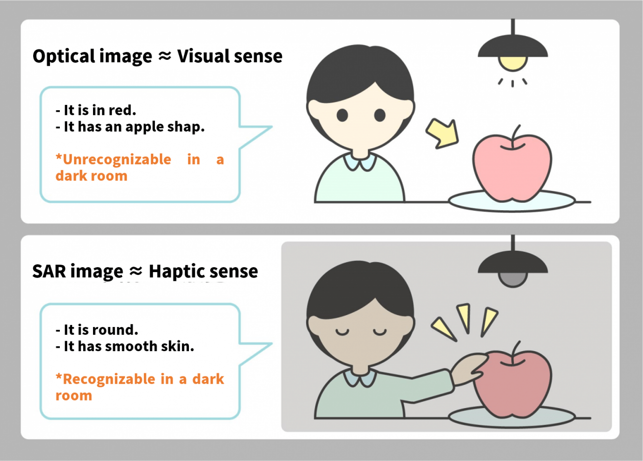
Images taken by an ordinary camera are called optical images which store visual information. As shown in the picture above, they tell us the color and shape of an objects, and we use such information to understand what the object is.
As they use the light reflected from the sun or other light sources, optical images cannot capture objects at night or under a cloud just like not seeing anything in a dark room.
In contrast, SAR data is linked to tactile sense; it can obtain information related to the shapes and roughness of the object. Using the reflection of radio waves emitted by satellite, SAR can register the object even at night or under a cloud.
For more information, please read this article:
*Special Feature:
Sorabatake editorial department
The Basics of Synthetic Aperture Radar (SAR): Use cases, Uses, Sensor, Satellite, and Wavelength
(2) Extract differences of two satellite images taken at different times
One example of SAR data utilization is extraction of the differences in satellite images taken at different times.
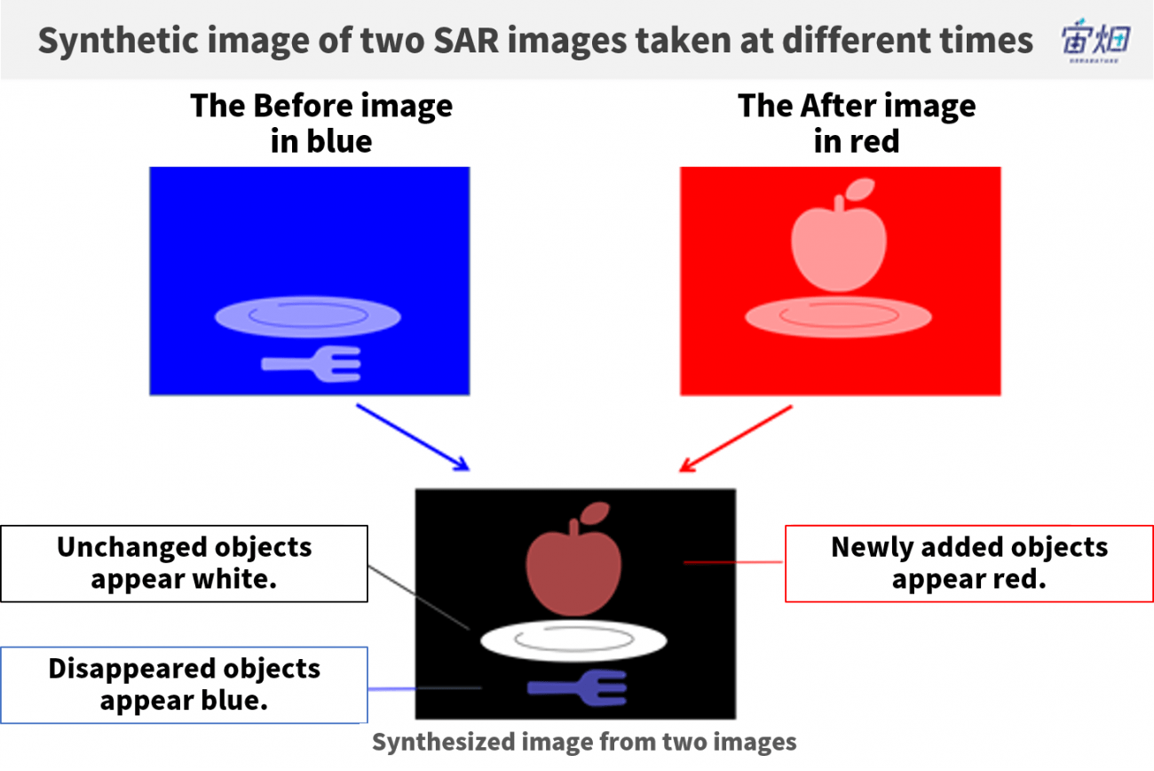
By synthesizing the former image colored in blue and the latter image in red, only objects of that color in the image come into sight.
In this example, the former image does not have an apple but the latter does, so the apple appears in red in the synthesized image. Conversely, the former image has a fork but the latter doesn’t, and the fork therefore appears in blue. The dish, included in both images, looks white. In contrast, the part of images where no objects are found (no radio waves are reflected back) looks black.
As seen above, you can observe the changes over time by synthesizing two images taken at different times colored in blue and red respectively.
(3) Acquire SAR images using API
Now we are going to actually implement the extraction difference using SAR images on Tellus.
Please refer to “API available in the developing environment of Tellus” for how to use Jupyter Lab (Jupyter Notebook) on Tellus.
Currently, two kinds of SAR images are available on Tellus: PALSAR-2 and ASNARO-2. Since we would like to compare satellite images taken at different times, we use PALSAR-2, which has a longer period of observing.
You can acquire the optical images of ALOS-2 with the API on Tellus
For how to use an API, refer to this summary in the reference.
*Please make sure to check the data policy (Data Details) in order not to violate the terms and conditions when using images.
https://gisapi.tellusxdp.com/PALSAR-2/{scene_id}/{z}/{x}/{y}.png
| scene_id | *You can call it up with the Scene ID obtained through the Scene Search API.
scene_id is represented with numbers (e.g. ALOS2241302900). |
| z | Zoom level of the tile
Example: 4 |
| x | X coordinate on the tile
Example: 13 |
| y | Y coordinate on the tile
Example: 6 |
*The PALSAR-2 images are taken from 2014 to 2018, but currently only those taken in 2018 are available to the public.
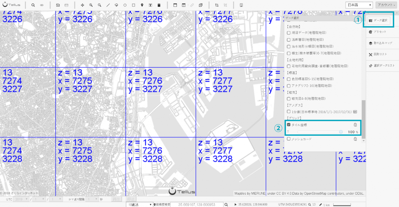
Tick the [Tile coordinate] (the second from the bottom) in [Data selection] on Tellus OS to show z, x, and y.
#必要なライブラリのインポート
import os, json, requests, math, cv2
from PIL import Image
from skimage import io
from io import BytesIO
import numpy as np
import matplotlib.pyplot as plt
%matplotlib inline

TOKEN = 'ここには自分のアカウントのトークンを貼り付ける'
DOMAIN = 'tellusxdp.com'

# PALSAR2イメージ取得
def get_PALSAR2_img(sceneid, z, x, y):
    url = 'https://gisapi.tellusxdp.com/PALSAR-2/{0}/{1}/{2}/{3}.png'.format(sceneid,z,x,y)
    headers = {
        'Authorization': 'Bearer ' + TOKEN
    }

    r = requests.get(url, headers=headers)
    if r.status_code is not 200:
        raise ValueError('status error({}).'.format(r.status_code))
    return io.imread(BytesIO(r.content))
#イメージ表示
img = get_PALSAR2_img('ALOS2221192900', 13, 7277, 3227)
io.imshow(img)
Get the token from APIアクセス設定 (API access setting) in My Page (login required).
Execute the code, and the image will be displayed.
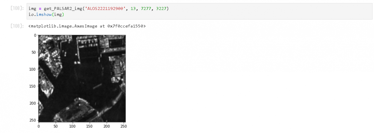
You can see the surroundings of Tokyo Bay.
(4) Compare satellite images taken at different times
We are going to apply this to synthesizing satellite images taken at different times.
First of all, look for the scene_id of the target image.
We use the Metadata Search on Tellus this time.
This video explains how to use it.
We picked out these two images.
(1) The former image
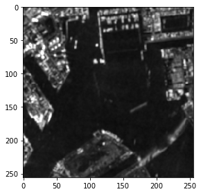
Credit: Original data provided by JAXA
scene_id: ALOS2221192900
Date taken: Thu, 28 Jun 2018 02:42:58 GMT
(2) The latter image
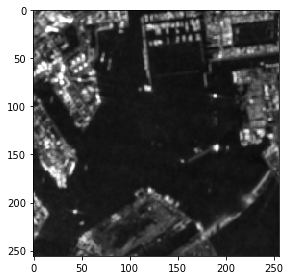
ALOS2243962900
Thu, 29 Nov 2018 02:43:00 GMT
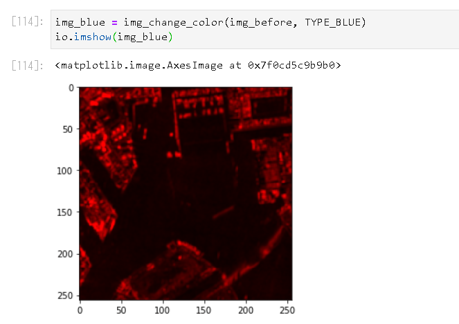
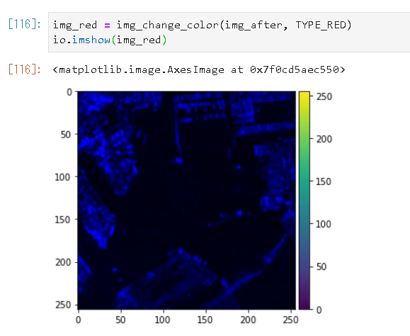
Convert these images in blue and red respectively.
# 色変換
TYPE_BLUE = 1
TYPE_RED = 2

def img_change_color(img,colortype):

    temp_img = cv2.split(img)

    # ゼロ埋めの画像配列
    if len(img.shape) == 3:
        height, width, channels = img.shape[:3]
    else:
        height, width = img.shape[:2]
        channels = 1
    zeros = np.zeros((height, width), img.dtype)
    #TYPE_BLUEだったら青だけ、それ以外(TYPE_RED)だったら赤だけ残し、他をゼロで埋める
    if colortype == TYPE_BLUE:
        return cv2.merge((temp_img[1],zeros,zeros))
    else:
        return cv2.merge((zeros,zeros,temp_img[1]))
Use these codes to convert the color of each image
Synthesize the two images into one.
# 重ね合わせ
def img_overray(img1, img2, accuracy):
    img_merge = cv2.addWeighted(img1, 1, img2, 1, 0)

    height, width, channels = img_merge.shape[:3]

    saveimg = np.zeros((height, width, 3), np.uint8)

    for x in range(height):
        for y in range(width):
            b = img_merge[x,y,0]
            g = img_merge[x,y,1]
            r = img_merge[x,y,2]

            if (r > b-accuracy and r < b+accuracy):
                saveimg[x,y] = [b,b,b]
            else :
                saveimg[x,y] = [r,g,b]

    return saveimg
Here, “accuracy” plays a modulatory role in synthesizing the two images.
Executing this command, you get the following result.
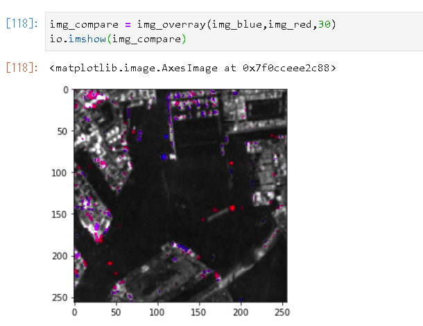
You can see the ships moving in and out of the bay through the blue and red dots.
Before moving on, here is the entire code:
import os, json, requests, math, cv2
from PIL import Image
from skimage import io
from io import BytesIO
import numpy as np
import matplotlib.pyplot as plt
%matplotlib inline

TYPE_BLUE = 1
TYPE_RED = 2

TOKEN = '自分のトークンを貼り付ける'
DOMAIN = 'tellusxdp.com'

#opncv -> pil 変換
def cv2pil(image):
    new_image = image.copy()
    if new_image.ndim == 2:  # モノクロ
        pass
    elif new_image.shape[2] == 3:  # カラー
        new_image = cv2.cvtColor(new_image, cv2.COLOR_BGR2RGB)
    elif new_image.shape[2] == 4:  # 透過
        new_image = cv2.cvtColor(new_image, cv2.COLOR_BGRA2RGBA)
    new_image = Image.fromarray(new_image)
    return new_image

# PALSAR2イメージ取得
def get_PALSAR2_img(sceneid, z, x, y):
    url = 'https://gisapi.tellusxdp.com/PALSAR-2/{0}/{1}/{2}/{3}.png'.format(sceneid,z,x,y)
    headers = {
        'Authorization': 'Bearer ' + TOKEN
    }

    r = requests.get(url, headers=headers)
    if r.status_code is not 200:
        raise ValueError('status error({}).'.format(r.status_code))
    return io.imread(BytesIO(r.content))

# 色変換
def img_change_color(img,colortype):

    temp_img = cv2.split(img)

    # ゼロ埋めの画像配列
    if len(img.shape) == 3:
        height, width, channels = img.shape[:3]
    else:
        height, width = img.shape[:2]
        channels = 1
    zeros = np.zeros((height, width), img.dtype)

    if colortype == TYPE_BLUE:
        return cv2.merge((temp_img[1],zeros,zeros))
    else:
        return cv2.merge((zeros,zeros,temp_img[1]))

# 重ね合わせ
def img_overray(img1, img2, accuracy):
    img_merge = cv2.addWeighted(img1, 1, img2, 1, 0)

    height, width, channels = img_merge.shape[:3]

    saveimg = np.zeros((height, width, 3), np.uint8)

    for x in range(height):
        for y in range(width):
            b = img_merge[x,y,0]
            g = img_merge[x,y,1]
            r = img_merge[x,y,2]

            if (r > b-accuracy and r < b+accuracy):
                saveimg[x,y] = [b,b,b]
            else :
                saveimg[x,y] = [r,g,b]

    return saveimg


# 比較するPALSAR-2のsceneid
#  赤くする画像
scene1 = 'ALOS2241452930'

#  青くする画像
scene2 = 'ALOS2218682930'

# タイル座標/精度
dstx = 3539
dsty = 1635
zoom = 12
aaccuracy = 30

# タイル取得範囲
tilenum = 3

# タイル4枚つなげて一つにする
img_blue = Image.new('RGB',(256 * tilenum, 256 * tilenum))
img_red = Image.new('RGB',(256 * tilenum, 256 * tilenum))
img_merge = Image.new('RGB',(256 * tilenum, 256 * tilenum))

for x in range(3):
    for y in range(3):
        print(dstx + x, dsty + y)
        img1 = get_PALSAR2_img(scene1, zoom, dstx + x, dsty + y)
        img2 = get_PALSAR2_img(scene2, zoom, dstx + x, dsty + y)

        img1 = img_change_color(img1, TYPE_BLUE)
        img2 = img_change_color(img2, TYPE_RED)

        img3 = img_overray(img1,img2,aaccuracy)

        img_merge.paste(cv2pil(img3), (x*256, y*256))


#表示用
temp_img = Image.new('RGB',(256 * tilenum,256 * tilenum))
temp_img.paste(img_merge,(0,0))

im_list = np.asarray(temp_img)
plt.imshow(im_list)
plt.show()
(5) Observe changes in different places
Look at other places in the same manner.
As the available data is from the latter half of 2018, we are going to look at the synthesized images in relation to events that happened during the period.
Harvesting a rice paddy field
You can find a harvested paddy field (the blue dots) in the image. The paddy field looks dark with standing water, and brighter when bare land is exposed after harvest, resulting in the brighter blue in the latter image.
It is also interesting to note that the three brighter dots along the river that represent something completely disappeared and we are not sure what they are.
# 比較するPALSAR-2のsceneid
# (赤) 2018/06/31 青森
scene1 = ALOS2226072790'

# (青)2018/10/23 青森
scene2 = 'ALOS2238492790'

#位置情報
dstx = 7290
dsty = 3073
zoom = 13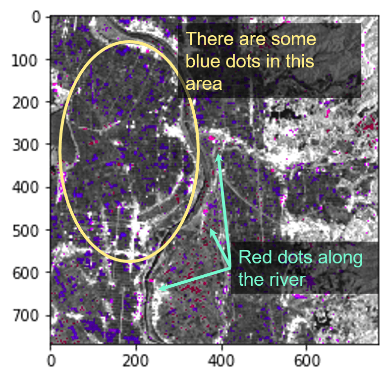
Satellite images after a landslide
Hokkaido Eastern Iburi earthquake occurred on September 6, 2018, causing many large-scale landslides.
The condition of the disaster can be captured by satellite.
# 比較するPALSAR-2のsceneid
# (赤)2018/7/14 北海道
scene1 = 'ALOS2219122750'

# (青)2019/9/20 北海道
scene2 = 'ALOS2233612750'

# タイル座標
dstx = 7324
dsty = 3017
zoom = 13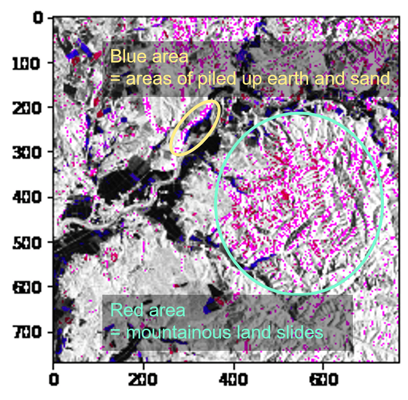
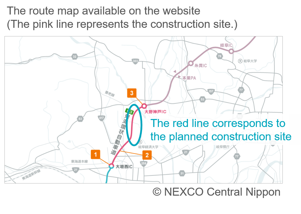
Progress of expressway construction
You can also see construction progress of large infrastructure using a satellite. Checking the construction progress of the TOKAI-KANJO EXPWY (between Ohno Godo IC and Ohgaki Nishi IC), which is scheduled to be completed in 2019. So from the satellite, you can clearly see the road under construction.
# 比較するPALSAR-2のsceneid
# (赤)2018/11/11 岐阜
scene1 = 'ALOS2241302900'

# (青)2018/06/10 岐阜
scene2 = 'ALOS2218532900'

# タイル座標
dstx = 14408
dsty = 6466
zoom = 14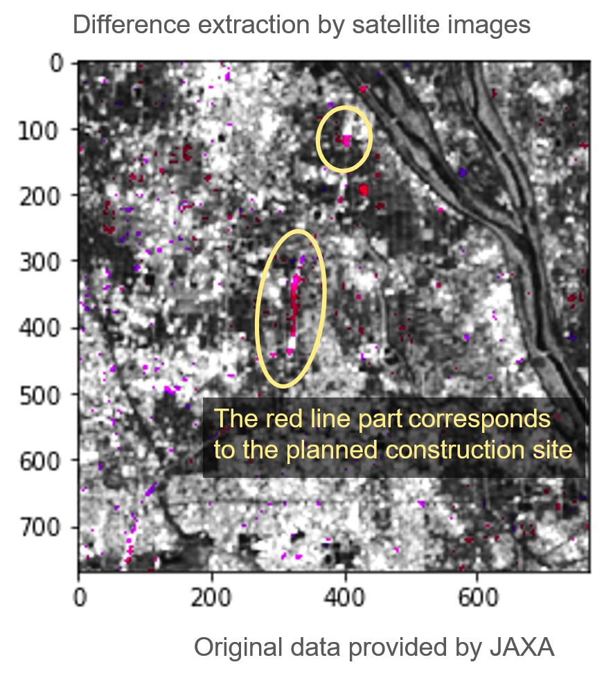
The traffic of ships
You can clearly see ships moving at sea on SAR images.
Looking at Tokyo Bay, you can see many ships going out to sea every day.
If ships can be detected by machine learning, the number of ships traveling in the bay per day can be determined, which may help as economic data or other circumstances.
# 比較するPALSAR-2のsceneid
# (赤)2018/6/28 東京湾
scene1 = 'ALOS2221192900'

# (青) 2019/11/29 東京湾
scene2 = 'ALOS2243962900'

# タイル座標
dstx = 3638
dsty = 1614
zoom = 12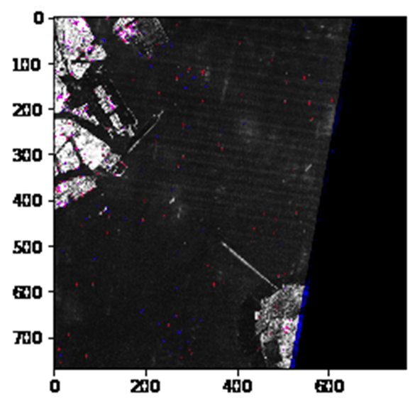
(6) Summary
In this article, we used SAR images of PALSAR-2 to examine the difference between two images taken at different times.
Although it is limited, and difficult to explain how to differentiate images, we can still observe changes in many places.
Try applying this method to places you are interested in!
We used PALSAR-2 for this trial since it has more observed images, you can also use the other SAR data on Tellus, ASNARO-2.
While ASNARO-2 has higher resolution images, it also captures very small gaps. It must be interesting for you to try it out and see how much difference can be observed.