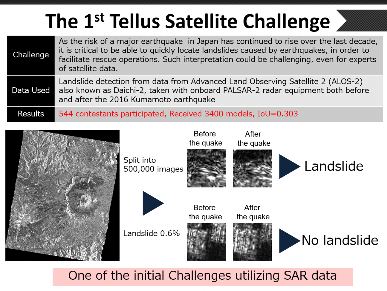
The 3rd Tellus Satellite Challenge! ~ Check out the Winners’ Models ~
The third Tellus Satellite Challenge was held with a mission to "detect the extent of sea ice." In this article, we explain the challenge and introduce the approaches of the winning teams.
(1) What is the Tellus Satellite Challenge?
“Tellus” is a satellite data platform intended to support industries across the globe. It is a project undertaken by the Japanese government as a part of their “2030 Space Industry Vision” initiative with the goal of doubling the scale of the space industry by early 2030. As a part of the Tellus project, the “Tellus Satellite Challenge” is a series of data analysis contests held to promote the use of Tellus, increase awareness of satellite data, discover new talent in field data science, and visualize examples of satellite data.
The two Tellus Satellite Challenges that have been held so far are:
The themes of the first and second challenges were introduced in previous articles.
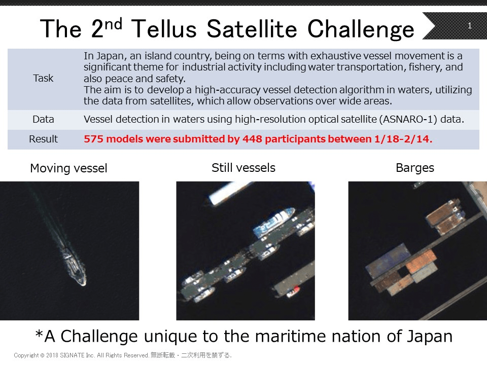
Talent in the AI industry from around the world have participated in the challenges, taking on issues using tools such as SAR and high-resolution optical data. We received the best practice for utilizing satellite data.
The third Tellus Satellite Challenge took on the “detection of sea ice extent.” Below we will explain the gist of the challenge and the approaches taken by the winners.
Article written in collaboration with: Toru Saito (SIGNATE), Noriyuki Aoi (SIGNATE)
(2) The Theme for the Third Challenge
The theme for the third challenge is “using SAR data to detect the extent of sea ice.”
Every year, ice can be seen drifting around the Sea of Okhotsk in Hokkaido. The beautiful ice is used as a tourist attraction, with ice watching tours being very popular. For the fishing and shipping industries, however, drift ice is a risk that can sink a ship, so it is important for the crew to be aware of where it is at all times.
To help ships know about ice conditions (including drift ice) around Hokkaido, a report is released daily by the 1st Regional Coast Guard Headquarters (the Japan Coast Guard). Information for the report is gathered through a combination of air and sea-based surveillance, and analysis of satellite imagery of sea ice taken from space. Of these, satellites stand out for their ability to cover large quantities of the ocean at any given time, unaffected by night time or weather thanks to synthetic-aperture radar (SAR) technology.
That being said, it currently takes a high level of skill to decipher SAR data on sea ice. Which brings us to the objective of this challenge: to develop an algorithm that accurately detects the extent of sea ice using SAR data.
The data that will be used is observational data taken by the Advanced Land Observation Satellite “Daichi 2” (ALOS-2) equipped with the PALSAR-2. The PALSAR-2 is a synthetic-aperture radar (SAR) that reflects electro-magnetic waves off of the earth’s surface to collect information about it. One of the characteristics of SAR is that it is unaffected by the time of day and weather. For details please refer to this article (“Detection of Sea Ice Extent Via Satellite Imagery” Competition by SIGNATE, Its Purpose and the Utilization of Images).
Ideally, we will be able to understand the following through the challenge.
– How capable AI is of aiding specialists in deciphering data?
– How accurate can an analysis using only satellite data be without the supplementation of surveillance data gathered on land?
The third challenge received 2,074 model cases from 557 participants during the contest period from October 4, 2019, to November 30, 2019. This very difficult challenge was met with many different high-tech AI. The contest was also very international, with seven of the top ten teams being from overseas.
(3) Summary of the Challenge
For this challenge, the IoU (intersection over union) index was used to evaluate the entries. This is an index used to indicate how much of an overlap there is with the image data and the actual extent of sea ice. It is a zero to one scale, with one being a perfect match. The higher the IoU is, the higher the accuracy.
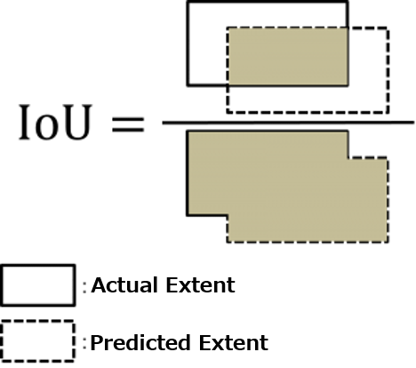
IoU is a common index for measuring segmentation tasks such as this. It is known for its sensitivity towards differences, with even small differences showing comparatively large changes. To get a high IoU score, it is necessary to capture even the smallest details in the curvature of the sea ice. As a reference, a score of over 0.8 is considered very accurate.
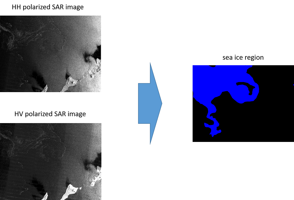
80 different scenes were distributed as learning data, with HH polarization and HV polarization versions of each SAR image. These pictures have been labeled (annotated) at the pixel level.
There are seven different types of labels based on sea ice density starting at 0 (no ice), 1 (sea ice levels 1-3), 4 (sea ice levels 4-6), 7 (sea ice levels 7-8), 9 (sea ice levels 9-10), 11 (lake), and 12 (land). Of these, the 1, 4, 7, and 9 labels for territories are defined as containing sea ice.
40 scenes were prepared to be used for evaluation, each given an HH polarization and HV polarization just like the data used for learning.
(4) Main Issues
There are two main issues for this challenge.
The first issue is that a single image is extremely large. A single image contains over 10,000 pixels, which makes it difficult to turn one directly into a model, so it is important to make it work with a smaller model size.
The other issue is the low contrast. As can be seen here, both HH and HV polarization images are very dark, making it is hard to tell if there is sea ice with the naked eye. That means that the entrants must skillfully construct a machine learning model that can pick up the subtle characteristics of the sea ice captured via SAR. In order to do this, they will have to prepare the images for processing while taking into account aspects of both HH and HV polarizations.
(5) Best Practices by the Winners
Now let’s take a look at the approaches taken by each winner.
There were a few common points in the approaches taken by the winning teams. For example:
– Downscaling
– Sliding Window Protocol
– Label Image Thresholding
– Transfer Learning Through ImageNet for the Precision Segmentation Model
– Ensemble Learning
These were the methods used by many of the teams.
To downscale an image is to remove some of the finer parts of the data and the noise it contains. On the other hand, through using the sliding window protocol, the model size can be slimmed down to an extent while retaining the information in the finer details.
Label image thresholding is to take the challenge of differentiating between the seven levels of sea ice densities and interchange it with an easier to understand method of measuring ice density (the extent of sea ice needs to be identified anyway, so this could be considered a natural process.)
Since there were only 80 images for this challenge, many of the winning teams used transfer learning from ImageNet. This involved using a SOTA (state of the art) segmentation model. Furthermore, in order to increase accuracy, there was a tendency for teams to use ensemble learning.
Below, we will take a deeper look into the pre-processing, modeling, and post-processing for approaches taken by each of the winning teams.
(6) A Closer Look at the Pre-process Approaches of Each Winner
Let’s start with how the images were pre-processed.
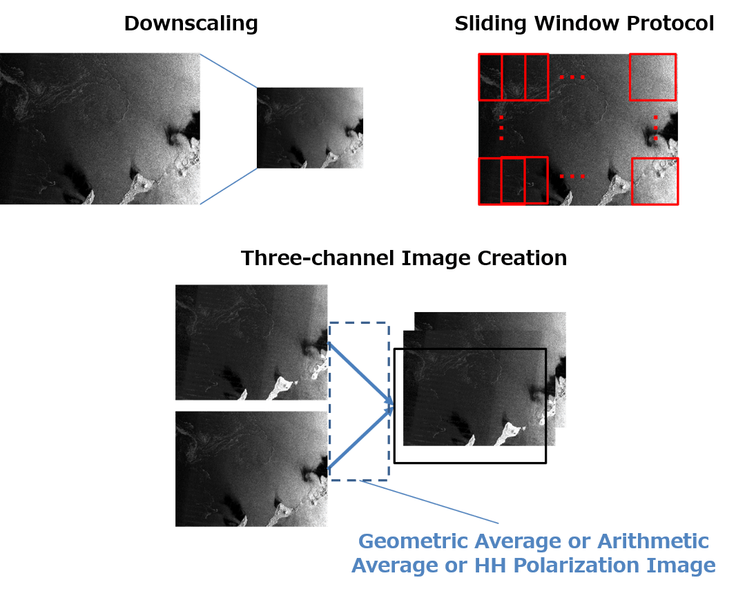
The first-place team downscaled their images, but kept them close to their original sizes at 8192 x 8192. They paired this with the sliding window protocol, with which they slid their windows to generate cropped images of 2028 x 2048, from which they downscaled to 512 x 512 and 1024 x 1024 pictures. It should be noted that they figured out a way to differentiate many of the finer details without cutting out too much information.
They then created three-channel images by creating new images from the geometric average of the HH and HV polarization images. Through their testing, they found that adding images with the geometric average provided higher accuracy than ones with the arithmetic average. Making them three-channel was also used in the transfer learning via ImageNet during the modeling phase. They used RGB images as standard by ImageNet.
If we take a look at the second-place winners, they downscaled the images to 0.25 times its original size and used the sliding window protocol to crop the images down to 512 x 512.
Compared to the first-place team, that is quite the downscaling. It seems they gave up on differentiating the finer details and tried to get rid of as much noise as they could. The second-place team made three-channel images, just like the first-place team, but the images they added were the arithmetic averages of the HH and HV polarization images.
The third-place team downscaled to 2048 x 3008 without using the sliding window protocol. This was likely done to avoid misdetection. Like the first and second-place teams, they also used three-channel images, but of the top three teams, they used the most simple approach to make them with two HH polarization images and 1 HV polarization image.
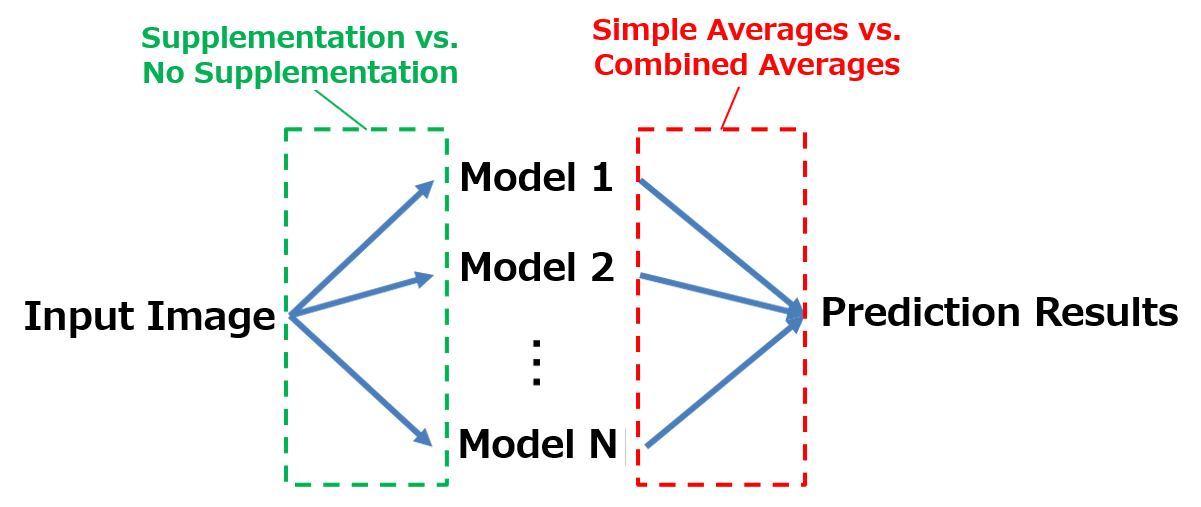
The teams that came in first and third inverted their images vertically and horizontally to supplement their predictions, but the second-place team chose not to do so.
(7) A Closer Look at the Modeling Approaches of Each Winner
Next let’s look at the model cases.
The first-place team used four SOTA segmentation models called HighResolutionNet and eight UNet models (the encoder is EfficientNet) for a total of 12 deep learning models, and transfer learning to acquire models already learned by ImageNet. They made two versions of UNet depending on the learning condition, so they effectively made three types of models. The structure of their HighResolutionNet and UNet network can be seen below.
HighResolutionNet is a subnetwork with four stages running parallel. These are designed to interact with feature maps of different scales by having them constantly transmit their 1x resolution (HR). This takes a high-resolution subnetwork and gradually adds lower resolution subnetworks. For the final stage there is an output of four scales, but only the scale with the highest output of 1x is used. Please refer to https://arxiv.org/abs/1908.07919 for more details.
UNet is a deep learning model used primarily in the medical field to differentiate images, and by using skip motion, it retains location data normally lost in the convolution and pooling stages. The name “UNet” comes from the fact the model looks like the letter U. Please refer to https://arxiv.org/abs/1505.04597 for more details.
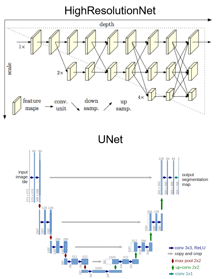
The first-place team inputted 512 x 512 images for HighResolutionNet, and 1024 x 1024 images for UNet. In other words, it seems they took a rough look at their HighResolutionNet models, and a more detailed look at their UNet models.
The second-place team, however, used UNet, and three types of models for each encoder (ResNext101, Senet154, Dpn92). Similar to the first-place team, they used transfer learning to learn what ImageNet had already learned, and created a five-fold learning pattern which gave them a total of 3×5=15 patterns. This is a technique often used called “bugging.” It looks like they made up for not supplementing their prediction image data by making more models.
The third-place team, like the second-place team, used UNet, and created two types of models for each encoder (DenseNet161 and Dpn92). They also went with transfer learning to learn from ImageNet. They created a four-fold learning pattern which gave them a total of 2×4=8 models.
All three teams required quite a bit of machine power to process the learning for their multiple heavy models. In any case, the winners were able to use high-level techniques to meet the requirements of this challenge.
(8) A Closer Look at the Post-process Approaches of Each Winner
The final phase of the process is the post-processing, where the teams fine-tune their modeling results.
First, the first-place team used the averages for each type of model, combining the three results to get an average they used for their submission. This was the most efficient size image according to their tests. The second and third-place teams, on the other hand, simply submitted their averages.
Let’s take a closer look. First is a comparison of the accuracy.
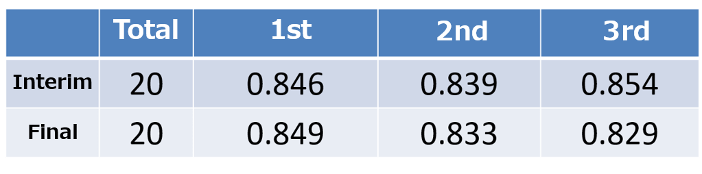
A tentative score was given halfway through the contest, with the final score being given at the end of the contest. The data used for the evaluation was split up into two parts, each receiving a tentative and final score. All three teams received scores of over 0.8 points, which means that their images were highly accurate.
It was a close call between the first through third places, with the third-place winner winning the tentative score. The tentative score and final scores tended not to change too much, which shows that each model was highly versatile. It also looks like the ensemble of multiple SOTA deep learning models was a key factor in winning. Among the winners, combining averages efficiently to properly fine-tune the input image created was what brought the first-place winner to the top.
Next, let’s take a look at the distribution of IoU graphs.
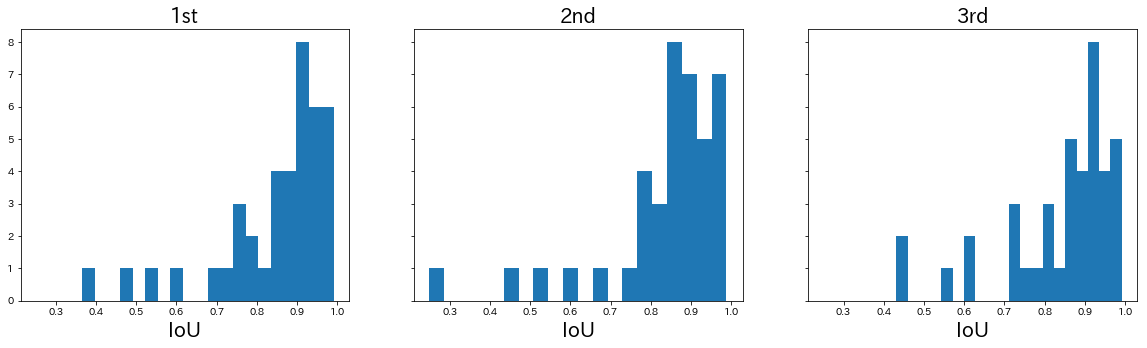
At a glance, they all have similar distributions. Most of them had a score of over 0.8, but there are one or two examples of the differentiation below 0.5 being hard to make.
So let’s examine each of the actual output results. First, the images below have an IoU value of over 0.95, which are almost perfect.
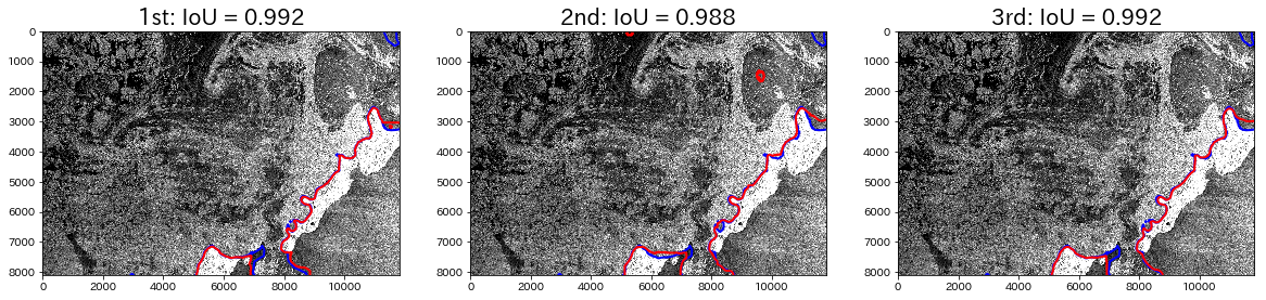
The red color is the outline of the predicted area, and the blue color is the actual area. It is a little hard to see, but the upper left part of the pictures are made up of sea ice, and the white part in the lower right is an island. You can tell that the outlines are almost perfectly in sync.
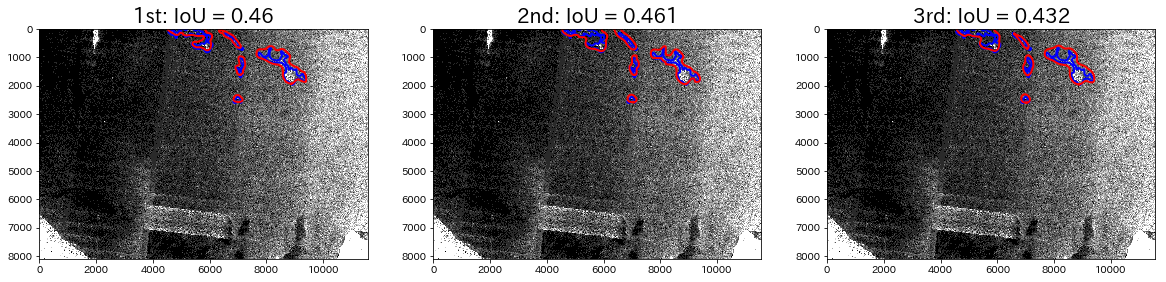
Next, let’s take a look at an IoU value of 0.86.
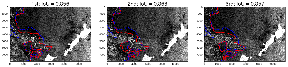
The left side of the territory shown in the picture is made up of sea ice. It has almost the entire area covered, but there is territory that hasn’t been detected. finally let’s look at some examples of IoU values under 0.6.
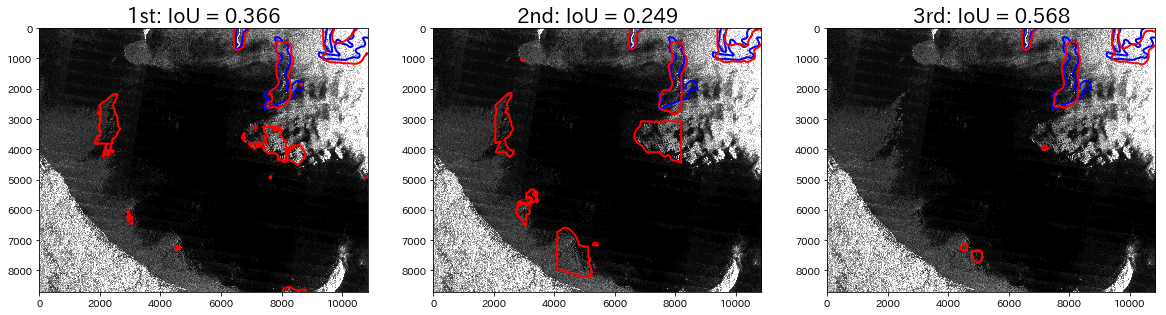
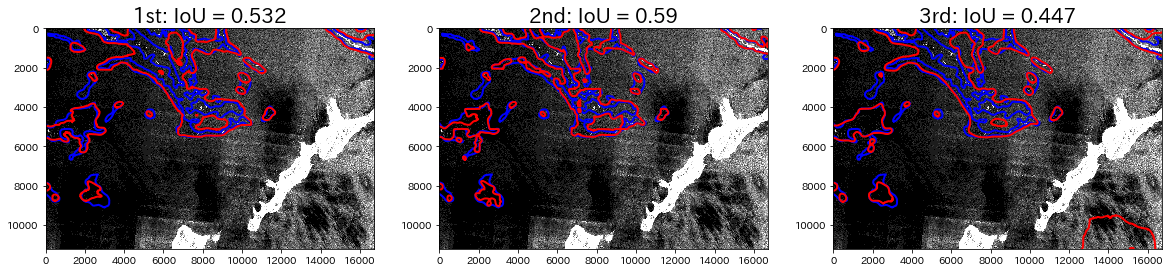
They have very low amounts of surface area that are accurate, and they are convoluted, which makes them hard to understand.
Taking a look at the first line, while they captured the general shape of the ice, first and second placed winners look particularly similar, which makes the misdetections stand out. First and second winners utilized the sliding window protocol, which likely led to many misdetections. The third-placed winner only performed downscaling, which seems to have led to less misdetections.
The second and third lines of images, on the other hand, shows more detailed shapes than that of the first and second placed winners images, but the third-placed winner only has a rough outline of the shape. For these lines, it looks like using the sliding window protocol made a difference.
In summary, it looks like using the sliding window protocol allowed the first and second placed winners’ images to pull ahead by effectively capturing the finer details. It looks like if the actual area of detection is smaller, it may be harder to accurately identify the image. With that, let’s take a look at the relationship between the IoU values and the actual surface area amongst all winners.
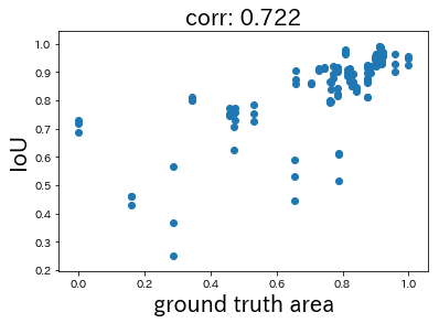
The X-axis shows a value that has been normalized from a logarithm for the actual surface area. The correlation coefficient is 0.722, which was recognized as the actual correlation. It looks like having less actual surface area when trying to make a detection leads to higher difficulty. This is likely because it increases the chance to make a misdetection, and makes it harder to see the extent of sea ice.
(9) An Overall Contest Evaluation
The contests resulted in a very close match with all of the winners achieving scores of over 0.8. The basic methods were all similar, and the efficient deep learning modeling approach to SAR images seems to stand out.
The SAR images used for this contest were originally 16-bit, but they were dropped to 8-bit for data reasons. Some of the information was lost by making them 8-bit, and keeping them 16-bit would have improved some of the scores of examples that had a hard time reading the images, which may have led to higher accuracy.
We also received comments from the participants, including: “The quality of the data was great” “It was a lot of fun” and “I would like to participate in the next contest.” We believe that the contest not only saw excellent results in terms of data, but was also very significant in spreading the word about Tellus.