Using Amedas Data to Visualize Temperature Forecasts and Rainfall in Real Time.
For this article, we used the Amedas minute-by-minute data available on Tellus for our analysis. We looked specifically at the minute-by-minute Amedas data in northern Kyushu for rainfall that occurred between 5th and 6th of July 2017.
Introduction
We’ve discussed how to extract Amedas data in a previous Sorabatake article.
[How to Use Tellus from Scratch] Get data from the Automated Meteorological Data Acquisition System (AMeDAS) on JupyterLab
In this article, however, we don’t actually get into practical uses for Amedas data, so this time we will be talking about the process for performing the following analysis and its results of the minute-by-minute Amedas data on the northern Kyushu rainfall that occurred in July of 2017.
- 1.Our analysis looks at whether or not we can use machine learning to predict the temperature using national rainfall intensity, average wind speed, and maximum instantaneous wind speed as features of the northern Kyushu rainfall that occurred in July of 2017 We’ll verify our predictions with data from Oita city where the prefecture’s capital building is, and Hita city, both cities of Oita prefecture that suffered the most damage from the storm.
- 2.Using the minute-by-minute data on rainfall intensity, we’ll visualize the network analysis on the northern Kyushu rainfall that occurred in July of 2017, then perform clustering and show the relationship between regions.
Our analysis will use scikit-learn and networkx instead of deep learning, so it will be possible for you to do the same on Tellus’ test environment found below. For those of you who are ineterested, it’s easy to apply to use the test environment and start your own analysis.
☆Sign up for Tellus here
For developers | Tellus
https://www.tellusxdp.com/ja/developer/
– Environment being applied for
test environment
(sakura cloud )
CPU: 4 Core
Memory: 8 GB
Disk: SSD 100 GB
Extracting the Data
Before we start our analysis, we’ll need to acquire the Amedas minute-by-minute data on July 2017 northern Kyushu rainfall from Tellus API.
First, since we will need to get the Amedas’ observation spot number, we’ll download the obs_station.xlsx data list of Amedas observation spots from the following website.
Amedas Obsersvation Spot List | washitake.com
http://washitake.com/weather/amedas/obs_stations.md
If you open up the downloaded excel, the sheet titled obs_stations has a list of stations across Japan and their prefecture ID number as well as spot IDs.
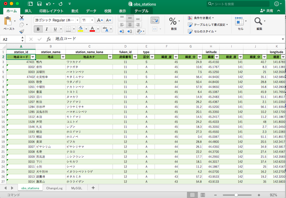
You can use python to extract the excel data, but csv is better for this, so on the obs_stations sheet, press command+a (or ctrl+a on windows) and copy the entire sheet to a different excel file, and save it as .csv. (the source code in this article uses obs_station.csv to load data later on.) If you save it properly, it will look like this.
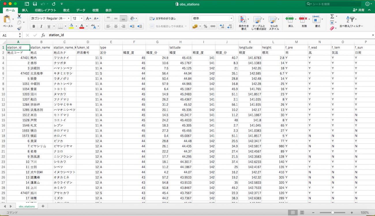
Save this csv file in the same spot you have your development environment for performing code.
Once you have the Amedas observation station IDs, next you’ll need to use the IDs on Tellus API to get the Amedas minute-by-minute July 2017 northern Kyushu rainfall data. You can find out how to get Amedas data from Tellus from the following URL.
Using API to get Amedas Data | Tellus How to Use
https://www.tellusxdp.com/ja/howtouse/dev/20200221_000254.html
This is the source code used for extracting the rainfall intensity data.
Extract_rain.py (for acquiring the rainfall intensity)
import pandas as pd
import requests, json
from datetime import datetime
from datetime import timedelta
from tqdm import tqdm

df = pd.read_csv('obs_stations.csv', header=1)
df1 = df[['地点','観測所番号1','区分']]
df1.columns = ['location','station_id','rank']
df2 = df[['地点','観測所番号2','区分']]
df2.columns = ['location','station_id','rank']
obs = pd.concat([df1,df2]).dropna(how='any')
obs['station_id']=obs['station_id'].astype('int')
obs = obs[obs['rank']=='S']
keys = obs['station_id']

TOKEN = "***************" # Tellusの開発環境のAPIアクセスからトークンを発行する

def get_amedas_1min(year, month, day, hour, minute, payload={}):
    """
    /api/v1/amedas/1minを叩く

    Parameters
    ----------
    year : string
        西暦年 (4桁の数字で指定) UTC
    month : string
        月 01~12 (2桁の数字で指定) UTC
    day : string
        日 01~31 (2桁の数字で指定) UTC
    hour : string
        時 00~23 (2桁の数字で指定) UTC
    minute : string
        分 00~59 (2桁の数字で指定) UTC
    payload : dict
        パラメータ(min_lat,min_lon,max_lat,max_lon)

    Returns
    -------
    content : list
        結果
    """

    url = 'https://gisapi.tellusxdp.com/api/v1/amedas/1min/{}/{}/{}/{}/{}/'.format(year, month, day, hour, minute)

    headers = {
        'Authorization': 'Bearer ' + TOKEN
    }
    r = requests.get(url, headers=headers, params=payload)

    if r.status_code is not 200:
        print(r.content)
        raise ValueError('status error({}).'.format(r.status_code))
    return json.loads(r.content)

def is_valid(value_obj, flag_obj):
    byte_size = {
        1: 127,
        2: 32767,
        4: 2147483647
    }
    return flag_obj['value'] <= 12 and value_obj['value'] != byte_size[value_obj['size']]

dl = {}
res = pd.DataFrame()
time = datetime(2017,7,5,0,0)
times = []
times.append(time)
while time <= datetime(2017,7,6,23,59):
    amedas = get_amedas_1min(str(time.year), str(time.month).zfill(2), str(time.day).zfill(2), str(time.hour).zfill(2), str(time.minute).zfill(2))
    amedas_sorted = sorted(amedas, key=lambda d: d['rain']['intensity']['value'], reverse=True)
    amedas_filtered = list(filter(lambda d: is_valid(d['rain']['intensity'], d['rain']['intensity_flag']), amedas_sorted))
    for data in amedas_filtered:
        id = str(data['station']['prefecture_no']['value']).zfill(2) + str(data['station']['observatory_no']['value']).zfill(3)
        if int(id) in list(obs['station_id']):
            dl.setdefault(obs[obs['station_id']==int(id)]['station_id'].values[0], []).append(data['rain']['intensity']['value']/10)
    time += timedelta(minutes=1)
    times.append(time)
rest = {}
for k,v in dl.items():
    k = str(k)
    ll = {}
    if len(times)-1==len(v):
        for i,value in enumerate(v):
            l = {times[i].strftime('%Y-%m-%d %H:%M:%S'):value}
            ll.update(l)
        rest[k]=ll

with open('Rain_intensity.json', 'w') as f:
    json.dump(rest, f, indent=4)
You can get Amedas’ minute-by-minute rainfall intensity data by saving this source code as a.py file and running it on Tellus’ test environment.
When running it on Windows, there is a chance you may get a csv file error. Make sure you specify the encoding format when you open the csv (if you have it saved as a csv UTF-8 file).
df = pd.read_csv('obs_stations.csv', header=1,encoding="utf-8")You should be able to run the program and acquire the two days worth of data in about an hour and a half, but we’d like to recommend running it in the background. Here’s how you can do that.
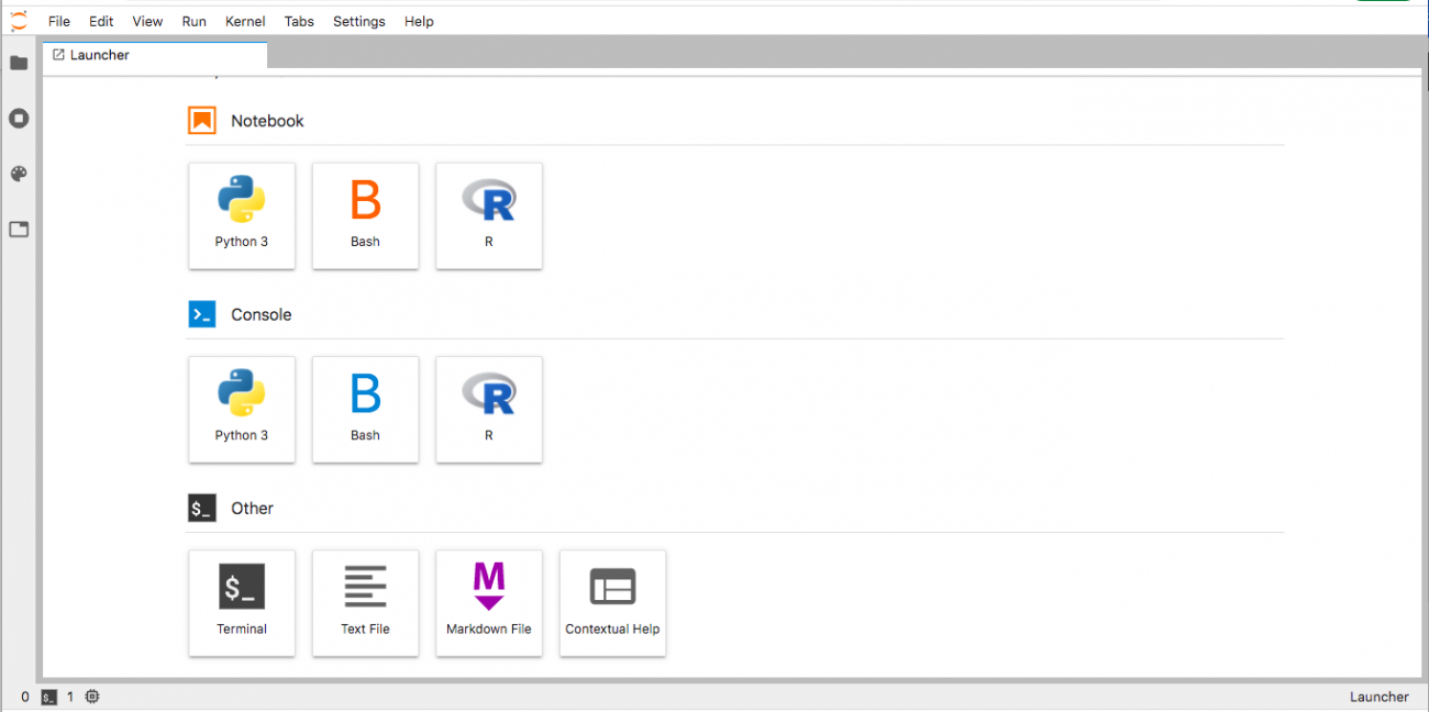
Firest, select “Other” on the Jupyter Lab’s test environment launcher then click “Terminal”.
You should see the terminal screen like the one shown below, so make your way to the folder that has files formatted as cd/work~.
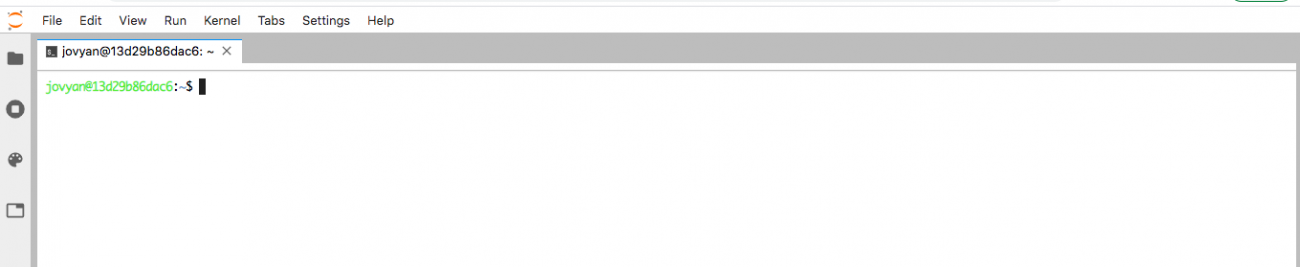
Once you get to this folder, you can perform the “python filename & saved as nohup python” to run the program in the background, and use the “ps-u” command to check on its progress.
If you get an error, there should be a file called nohup.out in the same directory that you ran the program file, and if it shows up as “cat nohup.out”, you should be able to confirm the contents of the error. If the program runs all the way through, you’ll end up with a json file called “Rain_intensity.json”.
The difference between the S and A data found in the obs_stations.csv is a matter of quality, with S-level observation stations having higher quality data. For this analysis, we acquired data specified to the S rank (about 150 spots). If you don’t specify which rank data you want, you will end up with about 1300 spots, which is a massive amount of data. For those of you who are interested, you are free to try conducting the analysis with all of the data available.
Finally, following the steps laid out above, you can get data for temperature, average wind speed, and maximum instantaneous wind speed. If you run all the steps listed here, it will give you everything you need to analyze machine learning for this analysis (for those of you who would like to only analyze the network, you’ll only need to visualize the real-time rainfall intensity data, and can skip the temperature and wind speed data.)
The import module and functions written into the source code are essentially the same, you can rewrite the is_valid function and run it for each temperature, average wind speed, and maximum instantaneous wind speed.
Running it in the background means you’ll be running multiple programs at once, so using nohup to combine the temperature, average wind speed, and maximum instantaneous wind speed data into one should make it possible to get them all in a few hours. This time, we will only be working with two days worth of Amedas data, but if you were to try and get a year’s worth of data, it would take a tremendous amount of time, so be careful when working with larger data sets.
Extract_temp.py (temperature)
dl = {}
res = pd.DataFrame()
time = datetime(2017,7,5,0,0)
times = []
times.append(time)
while time <= datetime(2017,7,6,23,59):
    amedas = get_amedas_1min(str(time.year), str(time.month).zfill(2), str(time.day).zfill(2), str(time.hour).zfill(2), str(time.minute).zfill(2))
    amedas_sorted = sorted(amedas, key=lambda d: d['rain']['intensity']['value'], reverse=True)
    amedas_filtered = list(filter(lambda d: is_valid(d['temperature']['deg'], d['temperature']['deg_flag']), amedas_sorted))
    for data in amedas_filtered:
        id = str(data['station']['prefecture_no']['value']).zfill(2) + str(data['station']['observatory_no']['value']).zfill(3)
        if int(id) in list(obs['station_id']):
            dl.setdefault(obs[obs['station_id']==int(id)]['station_id'].values[0], []).append(data['temperature']['deg']['value']/10)
    time += timedelta(minutes=1)
    times.append(time)
rest = {}
for k,v in dl.items():
    k = str(k)
    ll = {}
    if len(times)-1==len(v):
        for i,value in enumerate(v):
            l = {times[i].strftime('%Y-%m-%d %H:%M:%S'):value}
            ll.update(l)
        rest[k]=ll

with open('Temp.json', 'w') as f:
    json.dump(rest, f, indent=4)
Extract_wind.py (average wind speed)
dl = {}
res = pd.DataFrame()
time = datetime(2017,7,5,0,0)
times = []
times.append(time)
while time <= datetime(2017,7,6,23,59):
    amedas = get_amedas_1min(str(time.year), str(time.month).zfill(2), str(time.day).zfill(2), str(time.hour).zfill(2), str(time.minute).zfill(2))
    amedas_filtered = sorted(amedas, key=lambda d: d['rain']['intensity']['value'], reverse=True)
    for data in amedas_filtered:
        id = str(data['station']['prefecture_no']['value']).zfill(2) + str(data['station']['observatory_no']['value']).zfill(3)
        if int(id) in list(obs['station_id']):
            dl.setdefault(obs[obs['station_id']==int(id)]['station_id'].values[0], []).append(data['wind']['velocity_ave']['value']/10)
    time += timedelta(minutes=1)
    times.append(time)
rest = {}
for k,v in dl.items():
    k = str(k)
    ll = {}
    if len(times)-1==len(v):
        for i,value in enumerate(v):
            l = {times[i].strftime('%Y-%m-%d %H:%M:%S'):value}
            ll.update(l)
        rest[k]=ll

with open('Wind.json', 'w') as f:
    json.dump(rest, f, indent=4)
Extract_wind_max.py (maximum instantaneous wind speed)
dl = {}
res = pd.DataFrame()
time = datetime(2017,7,5,0,0)
times = []
times.append(time)
while time <= datetime(2017,7,6,23,59):
    amedas = get_amedas_1min(str(time.year), str(time.month).zfill(2), str(time.day).zfill(2), str(time.hour).zfill(2), str(time.minute).zfill(2))
    amedas_filtered = sorted(amedas, key=lambda d: d['rain']['intensity']['value'], reverse=True)
    for data in amedas_filtered:
        id = str(data['station']['prefecture_no']['value']).zfill(2) + str(data['station']['observatory_no']['value']).zfill(3)
        if int(id) in list(obs['station_id']):
            dl.setdefault(obs[obs['station_id']==int(id)]['station_id'].values[0], []).append(data['wind']['velocity_max']['value']/10)
    time += timedelta(minutes=1)
    times.append(time)
rest = {}
for k,v in dl.items():
    k = str(k)
    ll = {}
    if len(times)-1==len(v):
        for i,value in enumerate(v):
            l = {times[i].strftime('%Y-%m-%d %H:%M:%S'):value}
            ll.update(l)
        rest[k]=ll

with open('Wind_max.json', 'w') as f:
    json.dump(rest, f, indent=4)
Analysis Part 1: Using Machine Learning to Predict Temperature
We have the features we need to run the API on Tellus, so next, we’ll verify whether or not we can predict the temperature from features made up of rainfall intensity and maximum instantaneous wind speed.
Method:
For this article, we’ll use a generic machine learning library called scikit-learn to conduct SGD (stochastic gradient descent) learning. Conducting the learning online means the learning process will end much quicker than using the Gaussian process and multi-layer perception.
Source Code (Result):
We’ve posted source codes that can be ran on Jupyter Lab’s notebook
We’ll start off by loading the required module and acquiring the observation station ID
import numpy as np
import pandas as pd
import json
from scipy import signal
# SGD:確率的勾配降下法
from sklearn import linear_model, metrics
"正規化"
from sklearn.preprocessing import StandardScaler
from sklearn import preprocessing
import matplotlib.pyplot as plt

df = pd.read_csv('obs_stations.csv', header=1)
df1 = df[['地点','観測所番号1','区分']]
df1.columns = ['location','station_id','kubun']
df2 = df[['地点','観測所番号2','区分']]
df2.columns = ['location','station_id','kubun']
obs = pd.concat([df1,df2]).dropna(how='any')
obs = obs[obs['kubun']=='S']
obs['station_id']=obs['station_id'].astype('int')
keys = obs['station_id']
First, we’ll process the data we extracted earlier by splitting it into training data and test data. The test data we’ll be using will look at Oita prefecture’s Hita and Oita cities, as we mentioned before.
# 取り出したデータを日時のリスト、および観測所の地名:特徴量の辞書に分解する
def extract(obs,data):
  output = []
  label = []
  for k,v in data.items():
    try:
      if all(int(elem) <= 1000 for elem in list(v.values())):
        loc = obs[obs['station_id']==int(k)]['location'].values.tolist()
        vector = list(v.values())
        df = pd.Series(list(v.values()), index=v.keys())
        df.index = pd.to_datetime(df.index, utc=True)
        series = df.resample('1MIN').nearest()
        output.append(series)
        label.extend(loc)
    except:
      continue
  datetimes = v.keys()
  return datetimes, {k: v for (k, v) in zip(label, output)}

with open('Rain_intensity.json') as f:
    rain = json.load(f)
with open('Wind.json') as f:
    wind = json.load(f)
with open('Wind_max.json') as f:
    wind_max = json.load(f)
with open('Temp.json') as f:
    temp = json.load(f)
dates, rains = extract(obs,rain)
_, winds = extract(obs,wind)
_, winds_max = extract(obs,wind_max)
_, temps = extract(obs,temp)

# 先ほど取り出した辞書からデータフレームを作成し、テストデータと訓練データを取り出す。
df_rain = pd.DataFrame.from_dict(rains, orient='index')
df_wind = pd.DataFrame.from_dict(winds, orient='index')
df_wind_max = pd.DataFrame.from_dict(winds_max, orient='index')
df_temp = pd.DataFrame.from_dict(temps, orient='index')

# テストデータの作成
test_rain = df_rain.loc[['日田','大分']]
test_wind = df_wind.loc[['日田','大分']]
test_wind_max = df_wind_max.loc[['日田','大分']]
test_temp = df_temp.loc[['日田','大分']]
test_data = pd.concat([test_rain,test_wind,test_wind_max,test_temp], axis=1, sort=False)

# 訓練データの作成
df_rain = df_rain.drop(['日田','大分'], axis=0)
df_wind = df_wind.drop(['日田','大分'], axis=0)
df_wind_max = df_wind_max.drop(['日田','大分'], axis=0)
df_temp = df_temp.drop(['日田','大分'], axis=0)
train_data = pd.concat([df_rain,df_wind,df_wind_max,df_temp], axis=1, sort=False).dropna(how='any')
After that, we’ll split up the training data and test data that we have created to have their teaching labels and features. We’ll predict the features after we’ve standardized the data.
# 訓練データから特徴量とラベルに分解する
Train_data = np.zeros([len(np.array(np.hsplit(train_data, 4)[0]).flatten()),3])
for i,t in enumerate(np.hsplit(train_data, 4)):
  # 気温をラベル(教師データ)にする。※i==0なら降雨強度が教師になるので、ここを弄れば好きな値を教師データにできます。
  if i == 3:
    Train_label = np.array(t).reshape(-1)
  else:
    Train_data[:,i-1] = np.array(t).reshape(-1)

# テストデータから特徴量とラベルに分解する
Test_data = np.zeros([len(np.array(np.hsplit(test_data, 4)[0]).flatten()),3])
for i,t in enumerate(np.hsplit(test_data, 4)):
  if i == 3:
    Test_label = np.array(t).reshape(-1)
  else:
    Test_data[:,i-1] = np.array(t).reshape(-1)

# 訓練データとテストデータの正規化を行う。
# 特徴量の正規化
sc=StandardScaler()
stdscale=sc.fit(Train_data)
Train_data = stdscale.transform(Train_data)
Test_data = stdscale.transform(Test_data)
# ラベルの正規化
mm = preprocessing.StandardScaler()
Train_labels = mm.fit_transform(Train_label.reshape(1,-1)).flatten()
Test_labels = mm.fit_transform(Test_label.reshape(1,-1)).flatten()

# 特徴量(降雨強度、平均風速、最大瞬間風速)からラベル(気温)を予測する関数を作成
def Predict(Train_d,Train_l,Test_d,Test_l,algori,dates):
    predictresult=algori.fit(Train_d,Train_l).predict(Test_d)
    return {k: v for (k, v) in zip(dates, predictresult)}
SGD_ls = linear_model.SGDRegressor(loss="squared_loss")
Finally, we’ll bring up the functions we’ve predicted to create a graph of the results of our temperature predictions for both Hita and Oita cities.
For Hita city:
# 気温の予測(np.vsplit(Test_data, 2)[0],np.hsplit(Test_label, 2)[0]の要素で、0は日田市、1は大分市に対応しています)
result = Predict(Train_data,Train_label,np.array(np.vsplit(Test_data, 2)[0])
                                                 ,np.array(np.hsplit(Test_label, 2)[0]),SGD_ls,dates)
df_res = pd.DataFrame.from_dict(result, orient='index')
df_res.index = pd.to_datetime(df_res.index, utc=True)
df_res = df_res.resample('15MIN').nearest()

valid = pd.DataFrame.from_dict({k: v for (k, v) in zip(dates, temp['83137'].values())}, orient='index')
valid.index = pd.to_datetime(valid.index, utc=True)
valid = valid.resample('15MIN').nearest()

visual = pd.concat([df_res, valid], axis=1)
visual.columns = ['predict','true']
visual.plot()
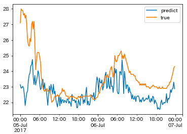
The prediction results for the temperature of the July 2012 northern Kyushu rainfall in Hita city can be seen above. These results take the per-minute results and averages them out over increments of 15 minutes. It appears the actual temperature was lower throughout the span of the graph, and notably we missed the shift in temperature at the very beginning during the night of July 5th.
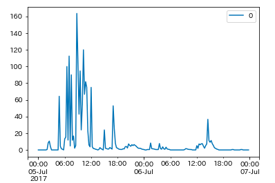
Below is the actual rainfall intensity for Hita city, and as you can see, it’s natural for temperature to decrease rapidly as rainfall intensifies. For the training data, we used this time, however, we didn’t include learning data in which the rainfall intensity increased at the rate it did in Hita city, so it likely had a bad impact on our data prediction.
valid = pd.DataFrame.from_dict({k: v for (k, v) in zip(dates, rain['83137'].values())}, orient='index')
valid.index = pd.to_datetime(valid.index, utc=True)
valid = valid.resample('15MIN').nearest()
valid.plot()
For Oita city:
result = Predict(Train_data,Train_label,np.array(np.vsplit(Test_data, 2)[1])
                                                 ,np.array(np.hsplit(Test_label, 2)[1]),SGD_ls,dates)
df_res = pd.DataFrame.from_dict(result, orient='index')
df_res.index = pd.to_datetime(df_res.index, utc=True)
df_res = df_res.resample('15MIN').nearest()

valid = pd.DataFrame.from_dict({k: v for (k, v) in zip(dates, temp['83216'].values())}, orient='index')
valid.index = pd.to_datetime(valid.index, utc=True)
valid = valid.resample('15MIN').nearest()

visual = pd.concat([df_res, valid], axis=1)
visual.columns = ['predict','true']
visual.plot()
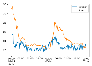
The graph above shows the prediction results for temperature from the July 2012 northern Kyushu rainfall in Oita city. This also shows the average per-minute results in increments of 15 minutes. Compared to Hita’s data, these results cover what really happened a little bit more accurately, but it wasn’t accurate enough to get the temperature data perfect. We may be able to improve the accuracy by limiting the amount of observation stations we use for our data, but it would require taking data over longer spans of time, so this may be something we have to work on in the future.
Incidentally, we used all of the data for our analysis earlier, so next, we’ll try cross-verifying it to evaluate its ability to be used generally. The code below shows the results of the models for each of the test data for Hita cities by cross-verifying them in 5 minute intervals. We’ll show just the evaluation of the model’s ability for now. Also, as we used a regression model, we are able to calculate an indicator-, called the coefficient of determination (poor accuracy is negative, and the highest accuracy is 1.0), which could be used to determine how good the model’s accuracy is.
from sklearn.model_selection import KFold
from sklearn.metrics import r2_score
kf = KFold(n_splits=5)
for train_index, test_index in kf.split(Train_data, Train_label):
    X_train, X_test = Train_data[train_index], Train_label[train_index]
    y_train, y_test = Train_data[test_index], Train_label[test_index]
    y_pred = SGD_ls.fit(X_train, X_test).predict(y_train)
    y_pred = y_pred.flatten()
    # 決定係数の算出
    r2 = r2_score(y_pred,y_test)
    print(r2)

    result = SGD_ls.predict(np.array(np.vsplit(Test_data, 2)[0]))
    result = {k: v for (k, v) in zip(dates, result)}
    df_res = pd.DataFrame.from_dict(result, orient='index')
    df_res.index = pd.to_datetime(df_res.index, utc=True)
    df_res = df_res.resample('15MIN').nearest()

    valid = pd.DataFrame.from_dict({k: v for (k, v) in zip(dates, temp['83137'].values())}, orient='index')
    valid.index = pd.to_datetime(valid.index, utc=True)
    valid = valid.resample('15MIN').nearest()

    visual = pd.concat([df_res, valid], axis=1)
    visual.columns = ['predict','true']

    ax = visual.plot()
The evaluation model used for our cross-verification can be seen below. When the value becomes negative, it means the model isn’t great at making accurate predictions. So from the results of our model’s ability, tests show that without real time data, it is hard to determine the temperature using just the rainfall intensity and wind speed.
-2.6458484868976395
-6.184890634543109
-2.883327231155094
-5.056130188249698
-3.89002396825747
Additional Analysis and Challenges
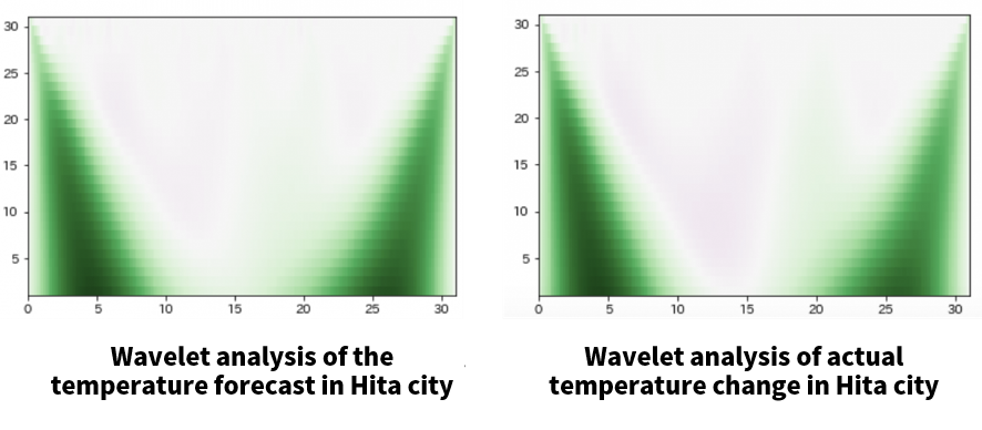
We’ve concluded that the results from before didn’t come up with accurate temperature values, so we’re going to conduct a wave rate analysis to verify whether or not we were able to grasp overall trends.
Source code:
# 真の気温結果で検証したい場合は、df_resをvalidに変えれば検証できます。
# y = np.array(valid.values.flatten())
y = np.array(df_res.values.flatten())
from scipy import signal
widths = np.arange(1, 31)
cwtmatr = signal.cwt(y, signal.ricker, widths)
plt.imshow(cwtmatr, extent=[0, 31, 1, 31], cmap='PRGn', aspect='auto',
           vmax=abs(cwtmatr).max(), vmin=-abs(cwtmatr).max())
The graph below shows that the characteristics of the frequencies are very similar when we compared our results from earlier to the actual temperature. So our analysis this time could not give us precise temperature predictions, but overall, the predictions for changes in temperature were quite accurate.
The following maybe some of the issues we will l have to work on in the future.
– We need to limit the area we are looking at in order to predict temperatures.
– In the areas that suffered a lot of damage, the changes were too rapid for us to make accurate rainfall intensity and wind speed predictions, so we may need to validate the Amedas data on conditions in areas that suffer such damage.
– For making more generalized predictions, we need data that spans over a longer period of time, not limited to the two day period of rainfall in northern Kyushu.
– We made no considerations for periodic changes in temperature, which means we may need to use features that exclude trends in the future.
Analysis Part 2: Visualize Rainfall in Real Time
Next, we will examine the network using chronological data we extracted on rainfall intensity to perform clustering, to try and figure out the national rainfall during the northern Kyushu rainfall in July of 2017.
Method:
This time, we will create a correlation matrix by solely looking at the correlation coefficient for chronological rainfall intensity data for each observation station. After that, we’ll use our calculated correlation matrix to visualize the network by using networkx on python’s network analysis library to perform clustering using louvain, a method commonly used for community extractions (this can be easily installed with pip).
Source Code (Result):
First, we create a correlation matrix based on the extracted rainfall intensity data and make it into a network. The network analysis doesn’t work in the Japanese language on the Tellus test environment, so you’ll need to conduct this part locally.
import numpy as np
import pandas as pd
import json
from scipy import signal

import networkx as nx
import matplotlib.pyplot as plt
%matplotlib inline
plt.style.use('seaborn')
plt.rcParams['font.family'] = 'IPAexGothic'

import warnings
warnings.filterwarnings('ignore')

df = pd.read_csv('obs_stations.csv', header=1)
df1 = df[['地点','観測所番号1','区分']]
df1.columns = ['location','station_id','kubun']
df2 = df[['地点','観測所番号2','区分']]
df2.columns = ['location','station_id','kubun']
obs = pd.concat([df1,df2]).dropna(how='any')
obs = obs[obs['kubun']=='S']
obs['station_id']=obs['station_id'].astype('int')
keys = obs['station_id']

with open('Rain_intensity.json') as f:
    data = json.load(f)


output = []
label = []
for k,v in data.items():
    if int(k) in list(keys):
      loc = obs[obs['station_id']==int(k)]['location'].values.tolist()
      df = pd.Series(list(v.values()), index=v.keys())
      df.index = pd.to_datetime(df.index, utc=True)
      series = df.resample('3H').nearest()
      output.append(series)
      label.extend(loc)
res = np.nan_to_num(np.corrcoef(output))
datetimes = v.keys()

# ネットワークによる可視化
# networkxに引き渡すエッジリストを準備
edge_lists = []
df = pd.DataFrame(res)
edge_name = label
df.index = df.columns = edge_name
# 相関係数DFより右上の三角行列およびに 0.6以下のデータをマスク
tmp_df = df.mask(np.triu(np.ones(df.shape)).astype(bool) | (df < 0.6))
# エッジリストを生成
edge_lists = tmp_df.stack().reset_index().apply(tuple, axis=1).values
G = nx.Graph()
G.add_weighted_edges_from(edge_lists)
# 描画の準備
plt.figure(figsize=(8,8))  #描画対象に合わせて設定する
pos = nx.circular_layout(G)
line_width = [d['weight']*1 for u,v,d in G.edges(data=True)]
nx.draw_networkx(G, pos=pos, font_size=10, node_color='gray', width=line_width, font_family='IPAexGothic')
plt.savefig('network.png')
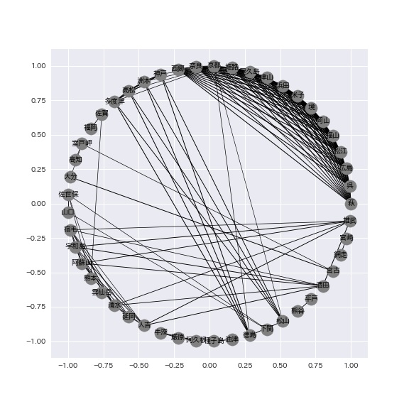
Once the data has been made into a networkm it should look like the following image. You can see that the network focuses primarily on the Kansai, Chugoku/Shikoku, and Kyushu regions of Japan. This time, we used a correlation coefficient under 0.6 to filter out the chronological rainfall intensity data for each observation station, but you can change the threshold to show the relationships between observation stations that had even a slight correlation.
Finally, we perform clustering using louvain based on the network above. The actual source code is as follows.
# クラスタリングの結果を表示
import community
partition = community.best_partition(G)
size = float(len(set(partition.values())))
pos = nx.spring_layout(G)
count = 0.
for com in set(partition.values()):
    count += 1.
    list_nodes = [nodes for nodes in partition.keys() if partition[nodes] == com]
    nx.draw_networkx_nodes(G, pos, list_nodes, node_size=20, node_color = str(count/size))
plt.show()
# クラスタリングの結果を保存
partition = community.best_partition(G)
labels = dict([(i, str(i)) for i in range(nx.number_of_nodes(G))])
nx.set_node_attributes(G, labels,'label')
nx.set_node_attributes(G, partition, 'community')
nx.write_graphml(G, "fourpath.graphml", encoding='utf-8')
You can use a software called cytoscape to show a clear picture of our final results, which looks as follows. You can read more about using cytoscape to visualize data here: https://qiita.com/bamboo-nova/items/ff26593380147ba48ee9)。 If you just want to see the results, you can see them by checking the dictionary format “partition”.
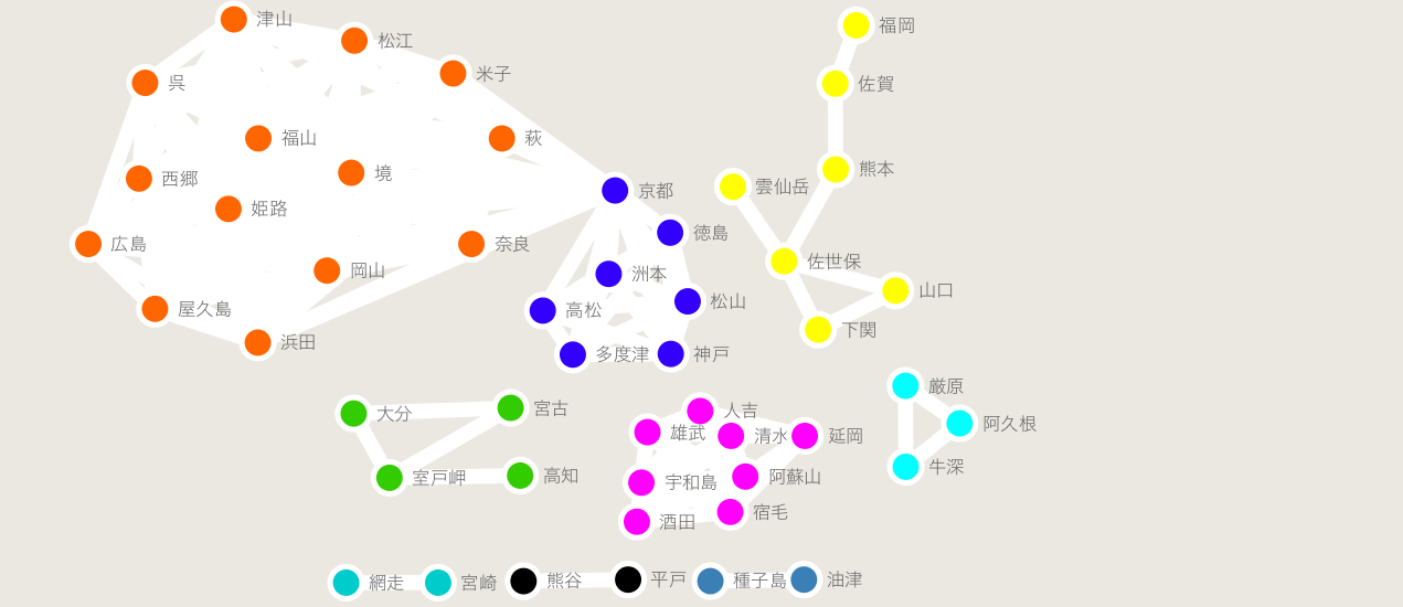
If you look closely, you can tell that the rainfall between July 5th and 6th in 2017 was focused around western Japan.
If we were to look at Kyoto, for example, you would be able to predict that there are two areas with vastly different rainfall intensities within Kansai, Chugoku, and Shikoku.
Looking at the part of Kyushu that got hit the hardest, while there is a bit of noise present, you can see that Oita was not included in the same cluster as its neighboring Fukuoka or Kumamoto prefectures, which means that even though they are both in Kyushu, you could predict that they had different levels of rainfall.
In regards to Kumamoto prefecture, we could also tell that there were different clusters for the city and mountain regions (meaning they had different rainfall intensities). By using only two days worth of chronological rainfall intensity data, we were able to see a general trend of rainfall intensity across the country.
In the future, we may be able to increase the accuracy of predicting natural disasters by analyzing chronological data for different periods.
Summary
For this article, we looked at Amedas’ minute-by-minute data for the northern Kyushu storm that occurred between July 5th and 6th in 2017, and verified whether or not we could predict temperature using rainfall intensity and wind speeds. We took the chronological rainfall intensity data and made it into a visual network, to extract community data for each region. While we focused on the northern Kyushu storm from 2017, if we were to analyze chronological data from a longer span of time for a more focused region, we would likely be able to get much more accurate results for that region which could even be used for predicting natural disasters.
We also did this using Tellus’ test environment instead of a GPU environment. If you feel up to the challenge, definitely try using this source code as a base to play around with meteorological data from other regions to try and find out information on natural disasters.