大気中の汚染物質の季節変化を衛星データで可視化してみた
COVID-19による経済停滞により、世界的に大気状態が改善された、という話題を2020年、耳にされた方も多かったと思います。本記事では、地上データを分析することで大気状態の変化傾向を掴むと共に、衛星データから取得できる大気情報を解析することで、大気状態を可視化する方法をご紹介します。
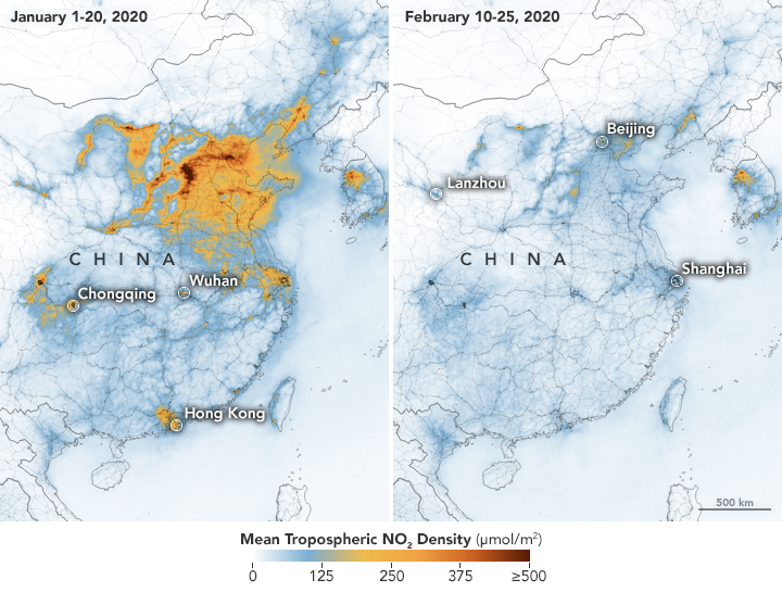
COVID-19による経済停滞により、大気状態が改善された、という話題を2020年、耳にされた方も多かったと思います。例えば、下記図のように、世界の工場である中国上空の二酸化窒素の濃度が薄まった話題や、インド北部で数十年ぶりにヒマラヤ山脈を視認できるようになった、という話題がありました。
実はこの大気の情報は、人工衛星から取得されており、かつ無料で公開されています。そのため、私たちの住んでいる地域の待機状態はどうなのか、ということを衛星データから調べることが可能です。
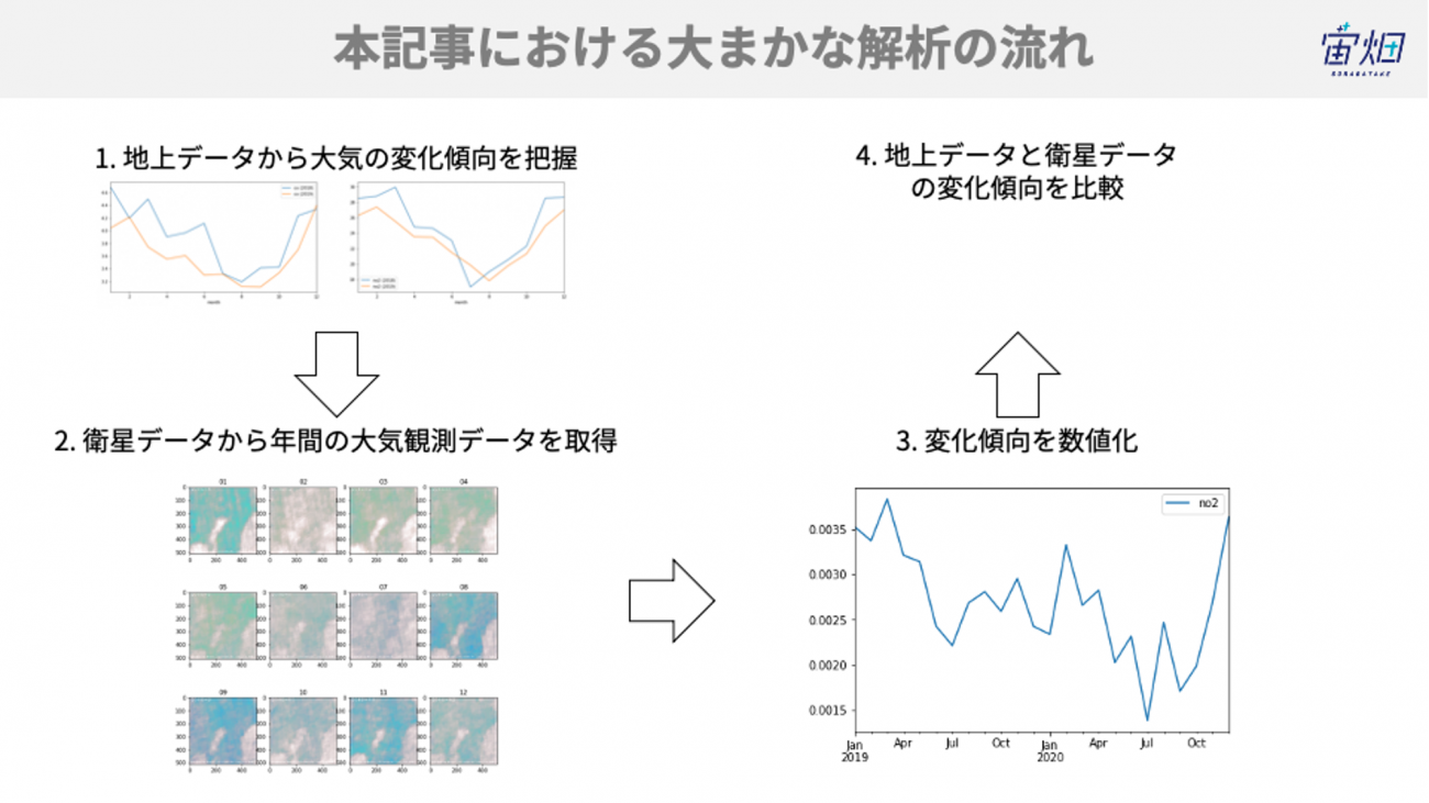
そこで、本記事では、一酸化炭素と二酸化窒素の変化傾向を地上データを通して確認した後に、人工衛星で観測した同じデータを取得する方法及び可視化する方法をご紹介します。
1. 大気汚染とSentinel-5Pによる観測
大気汚染は、人体に有害な窒素酸化物(NOx)や硫黄酸化物(SOx)などの物質が人工的に大気中へと排出される社会問題です。特に戦後の高度成長期に工場などから排出される人工的な汚染物質の増加が社会問題となりました。しかし、近年では様々な法規制が功を奏したためか、汚染物質は年々減少していると言われています。
Sentinel-5Pは大気のモニタリングを主要ミッションとする人工衛星です。Sentinel-5Pが観測によって観測された衛星画像を使うことで、様々な大気汚染物質を可視化することができます。今回はこのSentinel-5Pの画像を使って、大気汚染物質の排出量が季節変動する様子を可視化することに取り組みます。
2.検出方法と使用するデータの説明
2.1. 地上データについて
東京都のオープンデータカタログサイトにおいて、港区の大気汚染データが公開されています。こちらの観測データを使って、年間の大気汚染物質のうち、一酸化炭素(CO)と二酸化窒素(No2)の推移を可視化します。
過去20年分のデータをダウンロードして、欠損値などを取り除いてまとめたCSVファイルをこちらに置きましたので、よろしければお使いください。
2.2. 衛星データについて
Sentinel-5Pの衛星画像の取得には、Sentinel hubというサイトから提供されているAPIを利用します。Sentinel hubは、「センチネルシリーズ」と呼ばれる人工衛星によって観測されたデータの処理、配付、解析を行うためのGISプラットフォームです。Sentinelシリーズの衛星画像は他にもOpen Access Hubや、Amazon社が提供している AWSからも取得することができます。
データ取得にはユーザーアカウントが必要なので、アカウントをお持ちでない方は右上のSIGN INリンクからアカウントを作成してください。
3.コードと結果のご紹介
3.1. 地上データの可視化
それでは実際にコードを書いていきます。
最初に必要なライブラリを読み込み、港区における地上での観測データを可視化します。
港区の観測場所は一の橋、麻布、港南、芝浦、赤坂と5ヶ所存在するのですが、最もデータの欠損が少ない一の橋の2018年および2019年のデータを利用します。
!pip install requests_oauthlibimport os
from skimage import io
from io import BytesIO
import cv2
import requests
import numpy as np
import pandas as pd
import matplotlib.animation as animation
from IPython.display import HTML
from PIL import Image
import matplotlib.pyplot as plt
%matplotlib inline
all = pd.read_csv('minatoku.csv')
data = all.query('地区 == "一の橋"').set_index('ymd')
monthly = data.groupby(['year', 'month']).mean().rename(columns={'一酸化炭素[0.1ppm]': 'co', '二酸化硫黄[ppb]': 'so2', '二酸化窒素[ppb]': 'no2', 'オキシダント[ppb]': 'oxidant'})[['co', 'so2', 'no2', 'oxidant']]
plt.figure(figsize=(20, 5))
ax1 = plt.subplot(1, 2, 1)

monthly.loc[2018][['co']].rename(columns={'co': 'co (2018)'}).plot(ax=ax1)
monthly.loc[2019][['co']].rename(columns={'co': 'co (2019)'}).plot(ax=ax1)

ax2 = plt.subplot(1, 2, 2)
monthly.loc[2018][['no2']].rename(columns={'no2': 'no2 (2018)'}).plot(ax=ax2)
monthly.loc[2019][['no2']].rename(columns={'no2': 'no2 (2019)'}).plot(ax=ax2)
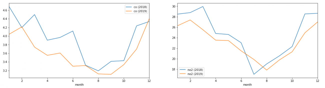
左の図が一酸化炭素、右の図が二酸化窒素の推移になります。
こちらのグラフをみると、どちらの汚染物質も2月ごろの寒い時期に最も大きい値を示し、8月から9月にかけて最も少なくなり、また12月になるにかけて数値が上昇していく傾向にあることがわかります。
このことからこの2つの大気汚染物質は冬に最も多くなり、夏に最も少なくなる、と言えそうです。
神奈川県ホームページでも下記のような記述がありました。
冬季は大気がよどみやすく、また、交通量の増加や事業所での暖房機器(ボイラーなど)の使用などにより、PM2.5(微小粒子状物質)の原因物質である窒素酸化物(NOx)の濃度が高くなる傾向があります。
やはり冬は大気汚染物質が増加する傾向があるようです。
次のステップでは、Sentinel-5Pにより観測された衛星画像上でも、その傾向が読み取れるのか、確認していきます。
3.2. 衛星データを取得する
それではSentinel Hubから衛星画像を取得します。
まずデータを取得する範囲を決めたいと思います。キーン州立大学が公開しているツールを利用し、画像を取得したい領域の座標を求めます。
#関心領域のポリゴン情報の取得
from IPython.display import HTML
HTML(r' width="960" height="480" src="https://www.keene.edu/campus/maps/tool/" frameborder="0">')
※r'のあとに<iframeを挿入した上でコードを実行してください。
※<は半角に置き換えてください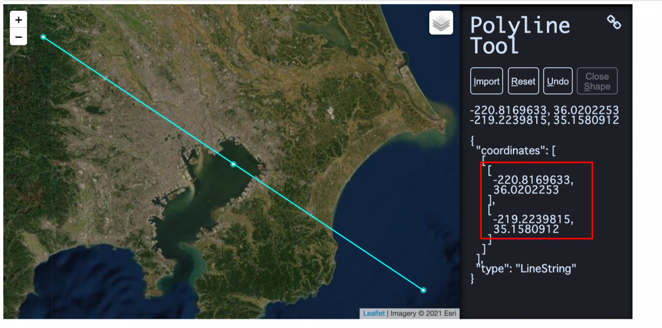
bbox = [
        -220.8169633,
        36.0202253,
        -219.2239815,
        35.1580912
      ]

#左回りもしくは右回り時の対応
for i in range(len(bbox)):
    if bbox[i] >= 0:
        bbox[i] = bbox[i]%360
    else:
        bbox[i] = -(abs(bbox[i])%360) + 360
ツールの仕様上、左回り、もしくは右回りするごとに360度ずつ加減されてしまうので、それを修正するコードを追加しています。こちらの処理については下記の記事を参考にしました。
【コード付き】Sentinel-2の衛星画像から指定した範囲のタイムラプスを作成する
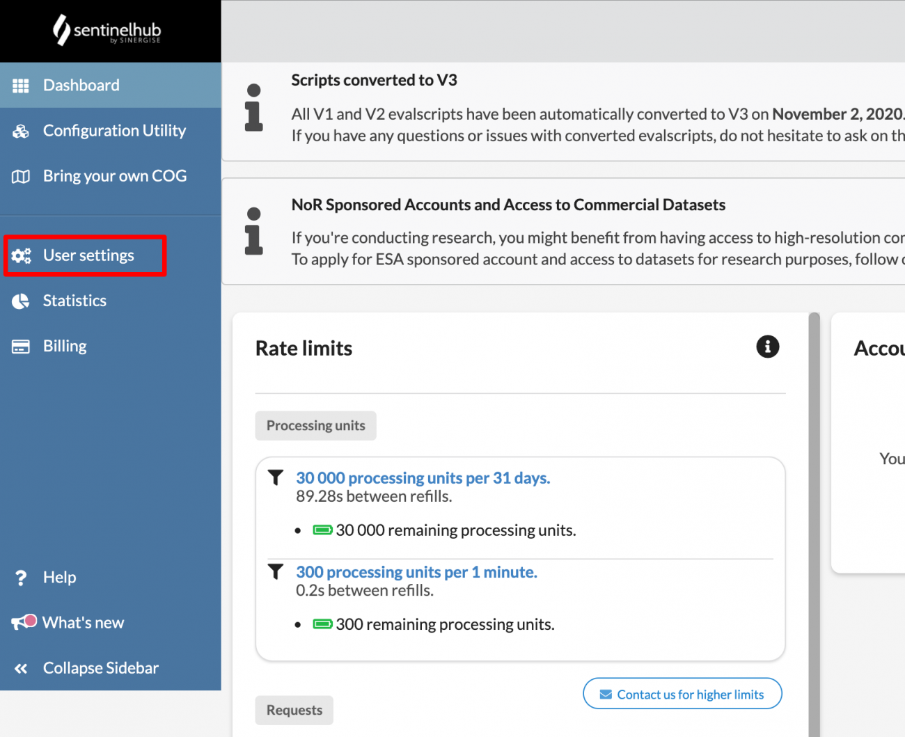
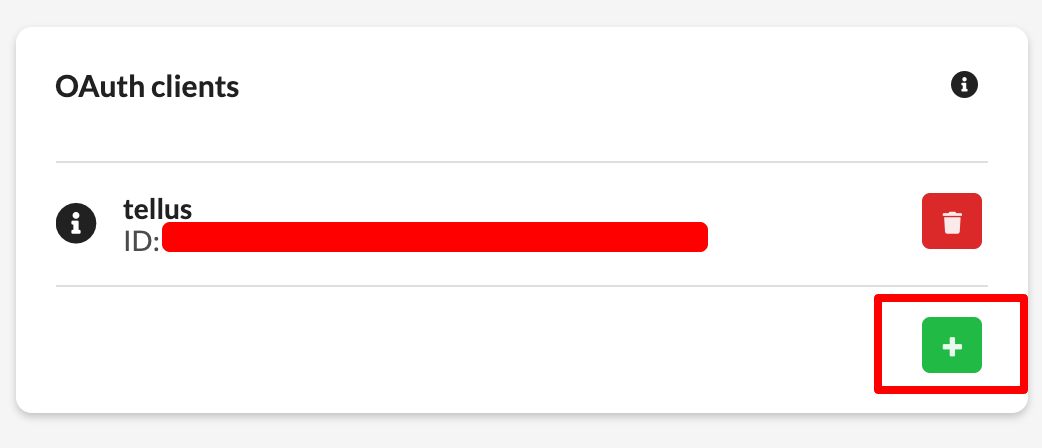
次にSentine hubから認証用のclient id と client secretを取得します。ログインすると下記の図の「User settings」というページに移動し、ページ右下から「+」ボタンを押して新しいOAuth Clientsを追加することで認証情報を得られます。
それでは認証情報を使って、実際にSentinelの衛星画像を取得してみましょう。
from oauthlib.oauth2 import BackendApplicationClient
from requests_oauthlib import OAuth2Session

# Your client credentials
client_id = '[ご自身のclient_idを貼り付けてください]'
client_secret = '[ご自身のclient_secretを貼り付ける]'
# Create a session
client = BackendApplicationClient(client_id=client_id)
oauth = OAuth2Session(client=client)
# Get token for the session
token_info = oauth.fetch_token(token_url='https://services.sentinel-hub.com/oauth/token',
                          client_id=client_id, client_secret=client_secret)
TOKEN = token_info['access_token']
# All requests using this session will have an access token automatically added
resp = oauth.get("https://services.sentinel-hub.com/oauth/tokeninfo")
Sentinel-2のデータを取得することで、指定している座標範囲が正しいことを確認した上で、Sentinel-5Pから一酸化炭素および二酸化窒素を取得します。
それぞれLevel2(L2)データを用います。
宙畑メモ
L2データとは・・・
Sentinel–5PはLevel–0、Level–1B、そしてLevel–2という異なったデータプロダクトを持ち、各々が異なった処理を受けています。
●Level–0プロダクトは、いわゆる生データで、基本的に私たちエンドユーザーが利用することはないものになります。こちらでは取得されたデータが撮影時間に紐付けられており、データが整えられるくらいの状態であると認識しておけば良いでしょう。
●Level–1Bでは、幾何補正やラジオメトリック補正が行われています。簡単に言ってしまえば、撮影した画像をGIS上で扱いやすくできるような処理、データから様々なノイズを除去したものです。ただし、L1Bに関連したプロダクトは、全てが放射輝度値になっており、物理量とはなっていませんし、取得できるデータも限定的です。
●Level–2プロダクトは、私たちが最も良く利用することになるものです。補正はL1Bから受け継ぎつつ、取得できる値は輝度値から物理量に変換されてあります。例えば一酸化炭素であれば、ppbの単位を持っています。
L1BとL2で取得できるデータプロダクトは以下の表をご参照ください。
*一部のデータは一般に公開されていません。
| SENTINEL–5/UVNS Level–1 product | Parameter(s) | Distribution |
| Radiance – UV | Calibrated Top-Of-Atmosphere (TOA) Earth radiance data from the UV bands. | To all users |
| Radiance – NIR | Calibrated Top-Of-Atmosphere (TOA) Earth radiance data from the NIR bands. | To all users |
| Radiance – SWIR | Calibrated Top-Of-Atmosphere (TOA) Earth radiance data from the SWIR bands. | To all users |
| Irradiance | Calibrated solar averaged irradiance data from all of the five SENTINEL–5/UVNS spectral bands | To all users |
| Calibration | Calibration data from all of the five SENTINEL–5/UVNS spectral bands | To expert users |
| OPF | Operational parameter file (OPF) containing the current calibration key data to be applied in processing | To expert users |
| SENTINEL–5/UVNS Level–2 products | Parameter(s) | Distribution |
| O3 | Ozone (O3) total column, tropospheric column, stratospheric vertical profile | To all users |
| NO2 | Nitrogen dioxide (NO2) total column, tropospheric column | To all users |
| SO2 | Sulfur dioxide (SO2) total column, layer height (TBC) | To all users |
| HCHO | Formaldehyde (HCHO) total column | To all users |
| CHOCHO | Glyoxal (CHOCHO) total column | To all users |
| CH4 | Methane (CH4) total column | To all users |
| CO | Carbon monoxide (CO) total column | To all users |
| Cloud | Cloud effective fraction, effective height, cloud mask | To all users (TBC) |
| Aerosol | Aerosol UV absorption index, layer height, optical depth (TBC) | To all users |
| Surface | Surface effective albedo, scene heterogeneity | To all users (TBC) |
| UV | UV spectrally resolved irradiance at surface, UV index | To all users |
(引用:Data Products – Sentinel–5 – Sentinel Online – Sentinel [WWW Document], n.d. URL https://sentinel.esa.int/web/sentinel/missions/sentinel–5/data-products (accessed 3.8.21).)
補足となりますが、本記事で紹介したEarth Engineが公開しているデータセットはL3処理を受けたものとなります。L3では品質の悪い、つまり信頼性に乏しいデータをharpconvertにより除外しており、実際の解析で直ぐに使えるデータです。データの質を判断する基準はqa_valueに含まれており、対象となる物質によって少し基準が異なります。例えばCOでは、
Both for the OFFL and NRTI product, it is recommended to use TROPOMI CO data associated with a quality assurance value qa_value > 0.5. The qa_value is provided as part of the CO data product and the definition used in the current data release is summarized in Table 3.
(引用:TROPOMI Level 2 Carbon Monoxide Total Column, n.d. https://doi.org/10.5270/S5P–1hkp7rp )
def get_s2_true_img(bbox):
    response = requests.post('https://services.sentinel-hub.com/api/v1/process',
    headers={"Authorization" : f"Bearer {TOKEN}"},
    json={
    "input": {
        "bounds": {
            "properties": {
                "crs": "http://www.opengis.net/def/crs/OGC/1.3/CRS84"
            },
            "bbox": bbox
        },
        "data": [
            {
                "type": "S2L2A",
                "dataFilter": {
                    "timeRange": {
                        "from": "2019-12-29T00:00:00Z",
                        "to": "2019-12-29T23:59:59Z"
                    }
                }
            }
        ]
    },
    "output": {
        "width": 512,
        "height": 512
    },
    "evalscript": """
    //VERSION=3
    function setup() {
      return {
        input: ["B02", "B03", "B04"],
        output: {
          bands: 3,
          sampleType: "AUTO" // default value - scales the output values from [0,1] to [0,255].
        }
      }
    }
    function evaluatePixel(sample) {
      return [2.5 * sample.B04, 2.5 * sample.B03, 2.5 * sample.B02]
    }

    """
    })
    img = Image.fromarray(io.imread(BytesIO(response.content)))
    img.putalpha(alpha=255)
    return np.array(img)
def get_co_img(bbox, day):
    response = requests.post('https://creodias.sentinel-hub.com/api/v1/process',
    headers={"Authorization" : f"Bearer {TOKEN}"},
    json={
      "input": {
          "bounds": {
                  "properties": {
                  "crs": "http://www.opengis.net/def/crs/OGC/1.3/CRS84"
              },
              "bbox": bbox
          },
          "data": [
              {
                  "type": "S5PL2",
                  "dataFilter": {
                      "timeRange": {
                          "from": f"{day}T00:00:00Z",
                          "to": f"{day}T23:59:59Z"
                      }
                  }
              }
          ]
      },
      "output": {
          "width": 512,
          "height": 512
      },
      "evalscript": """
      //VERSION=3

      function setup() {
        return {
          input: ["CO", "dataMask"],
          output: { bands:  4 }
        }
      }
      const minVal = 0.0
      const maxVal = 0.1
      const diff = maxVal - minVal
      const rainbowColors = [
          [minVal, [0, 0, 0.5]],
          [minVal + 0.125 * diff, [0, 0, 1]],
          [minVal + 0.375 * diff, [0, 1, 1]],
          [minVal + 0.625 * diff, [1, 1, 0]],
          [minVal + 0.875 * diff, [1, 0, 0]],
          [maxVal, [0.5, 0, 0]]
      ]
      const viz = new ColorRampVisualizer(rainbowColors)
      function evaluatePixel(sample) {
          var rgba= viz.process(sample.CO)
          rgba.push(sample.dataMask)
          return rgba
      }
      """
    })
    return io.imread(BytesIO(response.content))
def get_no2_img(bbox, day):
    response = requests.post('https://creodias.sentinel-hub.com/api/v1/process',
    headers={"Authorization" : f"Bearer {TOKEN}"},
    json={
        "input": {
            "bounds": {
                    "properties": {
                    "crs": "http://www.opengis.net/def/crs/OGC/1.3/CRS84"
                },
                "bbox": bbox
            },
            "data": [
                {
                    "type": "S5PL2",
                    "dataFilter": {
                        "timeRange": {
                            "from": f"{day}T00:00:00Z",
                            "to": f"{day}T23:59:59Z"
                        },
                        "timeliness": "NRTI"
                    }
                }
            ]
        },
        "output": {
            "width": 512,
            "height": 512
        },
        "evalscript": """
        //VERSION=3

        function setup() {
          return {
            input: ["NO2", "dataMask"],
            output: { bands:  4 }
          }
        }
        const minVal = 0.0
        const maxVal = 0.0001
        const diff = maxVal - minVal
        const rainbowColors = [
            [minVal, [0, 0, 0.5]],
            [minVal + 0.125 * diff, [0, 0, 1]],
            [minVal + 0.375 * diff, [0, 1, 1]],
            [minVal + 0.625 * diff, [1, 1, 0]],
            [minVal + 0.875 * diff, [1, 0, 0]],
            [maxVal, [0.5, 0, 0]]
        ]
        const viz = new ColorRampVisualizer(rainbowColors)
        function evaluatePixel(sample) {
            var rgba= viz.process(sample.NO2)
            rgba.push(sample.dataMask)
            return rgba
        }
        """
    })
    return io.imread(BytesIO(response.content))
また、コピーライトを追加するための関数も定義します。
def draw_texts(img, texts, font_scale=0.7, thickness=2):
    h, w, c = img.shape
    offset_x = 10  # 左下の座標
    initial_y = 450
    dy = int(img.shape[1] / 15)
    color = (255, 255, 255, 0)  # black

    texts = [texts] if type(texts) == str else texts

    for i, text in enumerate(texts):
        offset_y = initial_y + (i+1)*dy
        cv2.putText(img, text, (offset_x, offset_y), cv2.FONT_HERSHEY_SIMPLEX,
                    font_scale, color, thickness, cv2.LINE_AA)

def draw_result_on_img(img, texts, w_ratio=0.8, h_ratio=0.2, alpha=0.4):
    # 文字をのせるためのマットを作成する
    overlay = img.copy()
    pt1 = (0, 500)
    pt2 = (int(img.shape[1] * w_ratio), int(img.shape[0] * h_ratio))

    mat_color = (25, 25, 25)
    fill = -1  # -1にすると塗りつぶし
    cv2.rectangle(overlay, pt1, pt2, mat_color, fill)

    mat_img = cv2.addWeighted(overlay, alpha, img, 1 - alpha, 0)

    draw_texts(mat_img, texts)

    return mat_img

def add_copyright(img):
    new_img = draw_result_on_img(img, texts=["produced from ESA remote sensing data"], w_ratio=1.0, h_ratio=0.9, alpha=0.5)

    return new_img
3.3. 衛星画像を表示する
画像を取得する関数の準備ができたところで、任意の日付の衛星画像を取得し表示してみます。
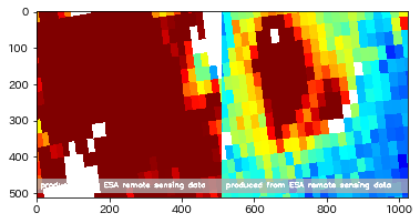
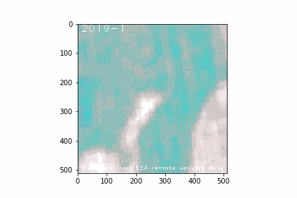
まずはSentinel-2からトゥルー画像を取得し、対象となっているエリアを確認してみましょう。
# 適当な日付を設定
day = "2019-12-31"

s2_true_img = get_s2_true_img(bbox)
s2_true_img = add_copyright(s2_true_img)
io.imshow(s2_true_img)
io.imsave('s2_true_img.png', s2_true_img)
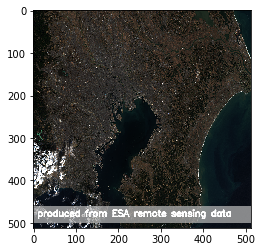
上記のような南関東あたりの画像が表示されれば成功です。
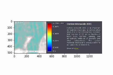
続けて、2019年12月31日の一酸化炭素と二酸化窒素の画像を取得します。
co_img = get_co_img(bbox, day)
co_img = add_copyright(co_img)
plt.imshow(co_img)
no2_img = get_no2_img(bbox, day)
no2_img = add_copyright(no2_img)
plt.imshow(no2_img)
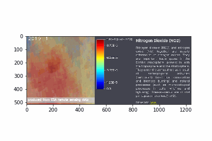
Sentinel hubから利用できるEO Browser上で一酸化炭素と二酸化窒素のカラースケールを確認すると次のようになっています。
# 画像をリサイズして連結する関数を用意
def get_concat_h(im1, im2):
    return cv2.hconcat([im1, im2])

# co_color_resize.pngはSentinel hubから切り出した一酸化炭素のカラースケール画像
co_color = io.imread(f'img_other/co_color_resize.png')
co_color = cv2.cvtColor(co_color, cv2.COLOR_RGB2RGBA)
print(co_img.shape)
print(co_color.shape)

plt.imshow(get_concat_h(co_img, co_color))

no2_color = io.imread(f'img_other/no2_color_resize.png')

# co_color_resize.pngはSentinel hubから切り出した二酸化窒素のカラースケール画像
no2_color = cv2.cvtColor(no2_color, cv2.COLOR_RGB2RGBA)
print(no2_img.shape)
print(no2_color.shape)

plt.imshow(get_concat_h(no2_img, no2_color))
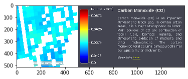
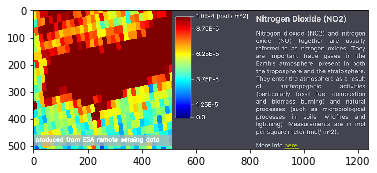
一酸化炭素と二酸化窒素の衛星画像を取得することができました。
取得する日付を何度か変えて確認してみると、夏より冬の方が確かに濃度が高そうです。
しかしながら、同じ月であっても日によって濃度が高かったり低かったりとまちまちなので、年間の大気の変化傾向を比較するには難しいことがわかります。
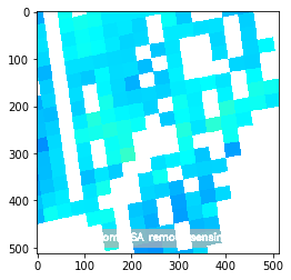
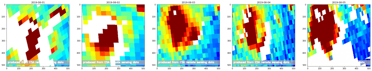
たとえば、2019年の8月1日から8月5日までを表示してみると、下記のように毎日その濃度が変化していることがわかります。
imgs = []
plt.figure(figsize=(40,40))
for day in range(1, 6):
    img = add_copyright(get_no2_img(bbox, f"2019-08-0{day}"))
    plt.subplot(1, 6, day)
    plt.title(f"2019-08-{str(day).zfill(2)}")
    plt.imshow(img)
3.4. 年間の観測データを取得する関数を作成する
そこで、下記のような方針で、Sentinel-5Pのデータから月ごとの一酸化炭素と二酸化窒素の濃度が分かる画像を作成し、年間の変化を目視で確認します。今回は簡単のため、2月に合わせて一ヶ月はどの月も28日までとしてデータを取得していきます。
1.各月ごとに1ヶ月間に観測された画像を取得する
2.各月ごとに1ヶ月間の画像の平均値の画像を作成する
3.各月ごとの平均値の画像を並べて表示する
4.各月ごとの平均値の画像を並べてGIF画像にする
それではまずは28日間の画像を取得する関数を定義します。
months = range(1, 13) # 1〜12月
days = range(1, 29)   # 1〜28日(2月を考慮して28日までを扱う)

def get_daily_imgs(get_img, year):

    for month in months:
        daily_imgs = []

        for day in days:
            date = f"{year}-{str(month).zfill(2)}-{str(day).zfill(2)}"
            path = 'daily_img/' + get_img.__name__ + '_' + date + '.png'
            if os.path.exists(path):
                continue

            daily_img = get_img(bbox, date)
            io.imsave(path, daily_img)
2019年の1年間の画像を取得します。量が多いのでかなり時間がかかります。途中で失敗することもあるので、進捗状況がわかるように、print文を仕込むなど、プログラムが動作していることを確認するためにすると良いでしょう。
year="2019"
get_daily_imgs(get_co_img, year)
get_daily_imgs(get_no2_img, year)
次に、平均値の画像を作成する関数と年月のラベルを追加する関数も定義します。
def get_mean_img(imgs):
    imgs = np.array(imgs)
    if len(imgs) != 0:
        img0 = imgs[0] #画像読み込み サイズチェック
        rows, cols, channels = img0.shape
        img_ave = np.zeros((rows, cols, channels)) #平均値入れる箱を初期化

        for img_tmp in imgs:
            if img_tmp.shape != img0.shape:
                print(i + ' : 画像ファイルサイズが異なります。\n全て同じサイズにしてください。\n')
            else:
                img_ave = img_ave + img_tmp

        img_ave = img_ave / len(imgs)

        return img_ave.astype(np.uint8)


def get_titled_imgs(get_img, year):

    imgs = []

    for month in months:
        daily_imgs = []

        for day in days:
            date = f"{year}-{str(month).zfill(2)}-{str(day).zfill(2)}"

            path = f'daily_img/{get_img.__name__}_{date}.png'
            daily_img = io.imread(path)
            daily_imgs.append(daily_img)

        img = get_mean_img(daily_imgs)

        cv2.putText(img, f"{year}-{month}", (10, 30),
                   cv2.FONT_HERSHEY_PLAIN, 2.5,
                   (255, 255, 255), 1, cv2.LINE_AA)
        img = add_copyright(img)

        imgs.append(img)
        io.imsave(f'img/{get_img.__name__}_{date[:7]}.png', img)

    return imgs
さらに画像を並べて表示する関数、GIF画像を作成する関数を定義します。
def show_imgs(imgs, suptitle=None):
    row = 3
    col = 4

    plt.figure(figsize=(10, 10))
    if suptitle is not None:
        plt.suptitle(suptitle)
    for i in range(len(imgs)):

        plt.subplot(row, col, i + 1)
        plt.title(f"{str(i + 1).zfill(2)}")
        plt.imshow(imgs[i])


def make_gif(imgs, filename='default', color=None):
    ims = []
    fig = plt.figure()

    for img in imgs:
        if color is not None:
            ims.append([plt.imshow(get_concat_h(img, color))])
        else:
            ims.append([plt.imshow(img)])

    ani = animation.ArtistAnimation(fig, ims, interval=700)
    ani.save(f'img/{filename}.gif', writer='pillow')
    plt.close()
以上で関数の準備は整いました。
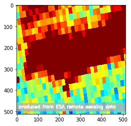
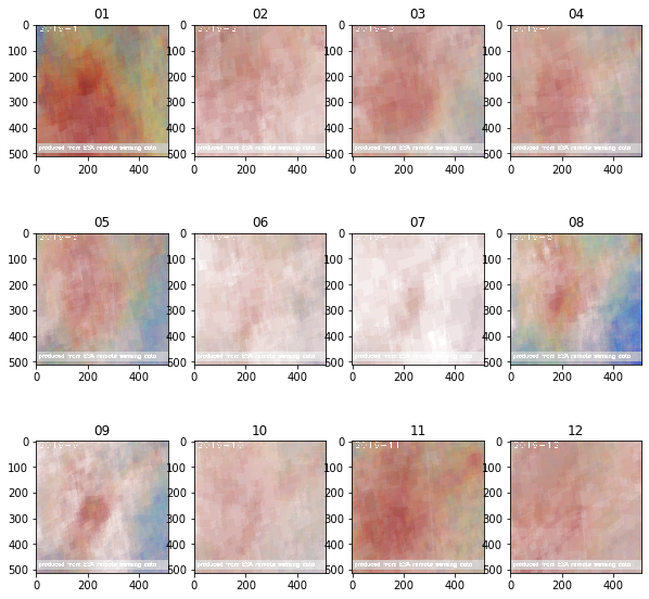
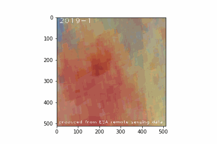
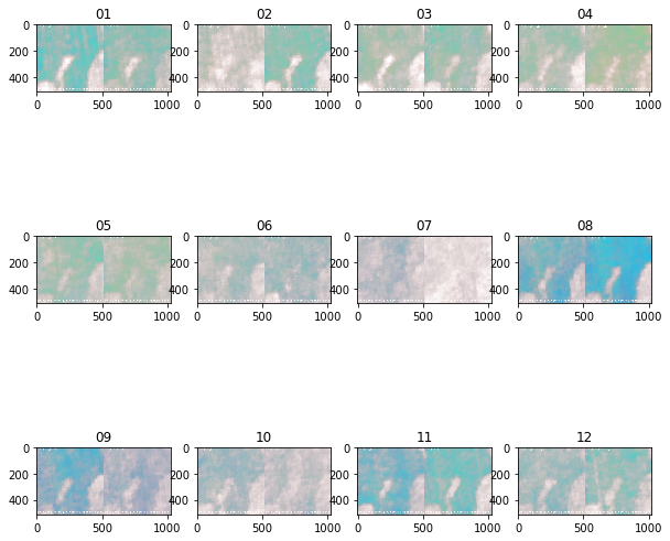
3.5. 一酸化炭素の年間の濃度変化を可視化する
それではまず一酸化炭素の年間推移を表示してみましょう。
year="2019"
co_imgs = get_titled_imgs(get_co_img, year)
show_imgs(co_imgs)
make_gif(co_imgs, filename=f"co_{year}")
HTML(f'="img/co_{year}.gif">')
※f'の直後に<img srcを挿入してください
※<は半角に置き換えてください
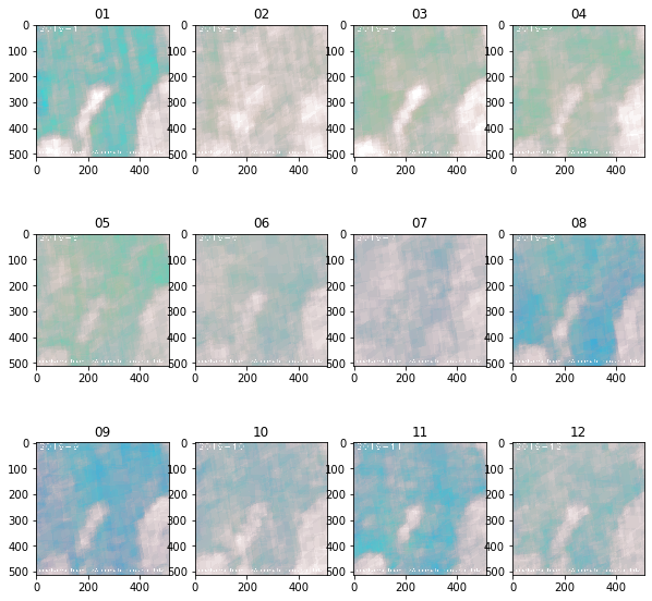
年間の変化を確認してみると、確かに5月や6月あたりは濃度が薄くなっているように見えます。一方で2月も濃度が薄いように見えたり、8月が意外と冬と同じぐらい高いように見える点が予想と反していました。
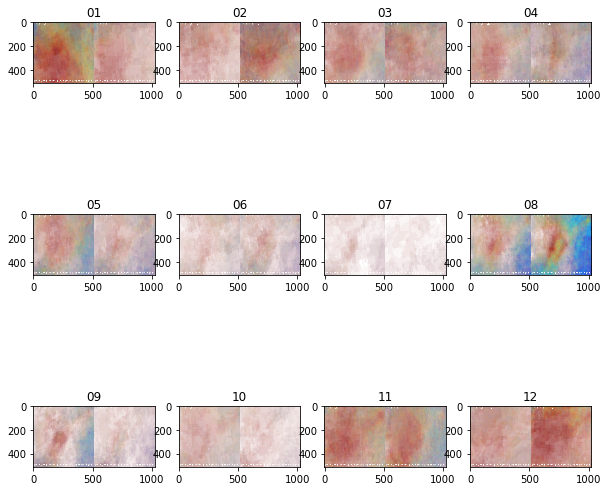
3.6. 二酸化窒素の年間の濃度変化を可視化する
続いて、二酸化窒素も年間の推移を確認します。
year="2019"
no2_imgs = get_titled_imgs(get_no2_img, year)
show_imgs(no2_imgs)
make_gif(no2_imgs, filename=f"no2_{year}")
HTML(f'="img/no2_{year}.gif">')
※f'の直後に<img srcを挿入してください
※<は半角に置き換えてください
こちらも同様に5月や6月は濃度が薄いことがわかります。また、8月も意外と高い値が観測されているように見えます。
4. 2020年の大気状態変化を算出してCOVID-19の影響を可視化する
2019年のデータを確認することで、衛星データから求めた一酸化炭素や二酸化窒素の濃度変化の傾向は、地上データと相関がありそうなことが定性的に分かりました。そこで、今度は2020年の衛星画像も取得することで、新型コロナウィルス(COVID-19)の影響による大気汚染物質排出量の変化があったのか、確認します。
先ほどと同じく2020年の年間の月ごとの大気成分の平均濃度の画像を取得します。
※計算処理に長い時間を要するので気長に待ちます。
year="2020"
get_daily_imgs(get_co_img, year)
get_daily_imgs(get_no2_img, year)
year="2020"
co_imgs = get_titled_imgs(get_co_img, year)
no2_imgs = get_titled_imgs(get_no2_img, year)
保存した2019年と2020年の各月ごとの平均値の画像を並べて保存する関数を定義します。
def get_concat_h(im1, im2):
    dst = Image.new('RGB', (im1.width + im2.width, im1.height))
    dst.paste(im1, (0, 0))
    dst.paste(im2, (im1.width, 0))
    return dst

def get_concat_imgs(type):
    months = range(1, 13) # 1〜12月
    imgs = []
    for month in months:
        month = str(month)

        img_1 = io.imread(f'img/get_{type}_img_2019-{month.zfill(2)}.png')
        img_2 = io.imread(f'img/get_{type}_img_2020-{month.zfill(2)}.png')
        concat_img = cv2.hconcat([img_1, img_2])
        io.imsave(f'img/{type}_{month.zfill(2)}_concat.png', concat_img)
        imgs.append(concat_img)
    return imgs
それでは一酸化炭素および二酸化窒素の2019年・2020年の比較画像を表示してみます。
co_concat_imgs = get_concat_imgs(type="co")
show_imgs(co_concat_imgs)
make_gif(co_concat_imgs, filename=f"co_concat")
HTML(f'="img/co_concat.gif">')
※上記のf'の直後に<img srcを挿入してください
※<は半角に置き換えてください
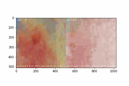
各画像の左側が2019年、右側が2020年の画像になります。
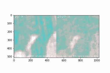
まず一酸化炭素ですが、初夏の時期に濃度が低く見えることはどちらの年も同じ傾向がありそうです。しかし、予想に反して2020年の方が高い値を観測していそうな月も、その逆の月もありそうです。
続いて二酸化窒素についても比較結果をみます。
no2_concat_imgs = get_concat_imgs(type="no2")
show_imgs(no2_concat_imgs)
make_gif(no2_concat_imgs, filename=f"no2_concat")
HTML(f'="img/no2_concat.gif">')
※f'の直後に<img srcを挿入してください
※<は半角に置き換えてください
こちらも同じく、2019年よりも2020年の方が増えた/減ったということは比較画像からは読み取れなさそうです。
以上のことから、一酸化炭素および二酸化窒素については、夏場には濃度が減少し、冬になるにつれて増加する傾向があると衛星データからも言えそうです。しかし、地上データで確認した傾向と反して、8月には濃度が高いという結果も出ました。
今回は単純に画像の画素値の平均から各月の画像を作成しましたが、日毎の画像を詳細に確認すると、外れ値となるような観測値を記録した日があり、そのことが今回の結果に影響しているのかもしれません。
そこで、ここまで利用してきたL2データではなく、外れ値等を処理したL3データを用いた解析を次の章では試みます。
5. L3データを使って大気状態の変化をグラフ化する
ここまで利用していたSentinel hubから取得した衛星画像はLevel-2データ(以下L2データ)に分類されるものでした。しかし、Level-3データを使うと、より正確な解析が行うことができます。
Level-3データ(以下L3データ)については下記のように説明されています。
Level-3 Processor Sentinel-5 P creates Level-3 data by converting it from ESA's free Sentinel-5P Level-2 data product. The default Sentinel-5 Level-2 data is delivered without a fixed grid, where the pixels are defined by latitude and longitude and form an irregular grid. The Level-3 processing resolves that by resampling the data to a regular spatial pixel grid.
UP42 Level-3 Processor Sentinel-5P
L3データはL2データにより高度な処理を行い、衛星画像同士を重ね合わせて解析することができるようになっているデータのことのようです。
そこで、ここからはL3データが利用可能なGoogleEarthEngineのAPIを使って、再度首都圏の二酸化窒素濃度の年間推移の解析を行ってみたいと思います。
ファイルの出力にGoogleDriveを使用するため、解析にはGoogleDriveとの連携が可能なGoogle Colaboratoryを用いました。
用いたコードは以下の通りです。
# Earth Engine Python APIのインポート
import ee
# GEEの認証・初期化
ee.Authenticate()
ee.Initialize()
from google.colab import drive
drive.mount('/content/drive')
# パッケージのインストール&インポート
!pip install rasterio
import numpy as np
import matplotlib.pyplot as plt
import rasterio
import time
def ImageExport(image,description,folder,region,scale):
task = ee.batch.Export.image.toDrive(image=image,description=description,folder=folder,region=region,scale=scale)
task.start()
while task.active():
print("proceeding...")
time.sleep(10)
# 取得
def GetImage(folder):
# データの読み込み
with rasterio.open(folder + '.tif') as src:
arr = src.read()
# numpy形式でデータを取得
print(arr.shape)
return arr[0]
# 可視化
def ShowImages(imgs, suptitle=None):
row = 3
col = 4
plt.figure(figsize=(5, 5))
if suptitle is not None:
plt.suptitle(suptitle)
for i in range(len(imgs)):
plt.subplot(row, col, i + 1)
plt.title(f"{str(i + 1).zfill(2)}")
plt.imshow(imgs[i])
# 衛星名を指定
satellite = 'COPERNICUS/S5P/NRTI/L3_NO2'
# バンド名を指定
band = 'NO2_column_number_density'
## エリアを指定
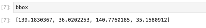
bbox = [139.1830367, 36.0202253, 140.7760185, 35.1580912]
geometry = ee.Geometry.Rectangle(bbox)
for i in range(1, 13):
print(i)
# 期間を指定
from_date = f'2019-{str(i).zfill(2)}-01'
to_date = f'2019-{str(i).zfill(2)}-28'
# 指定した条件でGEEからデータをロード
image = ee.ImageCollection(satellite).filter(
ee.Filter.date(from_date, to_date)).filter(
ee.Filter.geometry(geometry)).select(band).mean()
# 画像の取得
ImageExport(**{
'image': image,# 対象データの指定
'description': f's5p_NO2_data_2019_{i}',# ファイル名の指定
'folder':'GEE_DOWNLOAD',# Google Drive(MyDrive)のフォルダ名
'scale': 1000,# 解像度の指定
'region': geometry.getInfo()['coordinates']# 上記で指定した対象エリア
})
#フォントファイルのダウンロードと設定
!wget https://osdn.net/dl/mplus-fonts/mplus-TESTFLIGHT-063a.tar.xz
!xz -dc mplus-TESTFLIGHT-*.tar.xz | tar xf -
fontfile = "./mplus-TESTFLIGHT-063a/mplus-1c-bold.ttf"
from PIL import Image, ImageDraw, ImageFont
def add_credit(folder, ym):
img = Image.open(folder + '.jpg')
img = img.convert('RGB')
x = int(img.size[0]/1.6)
y = int(img.size[1]/20)
obj_draw = ImageDraw.Draw(img)
obj_font1 = ImageFont.truetype(fontfile, int(img.size[0]/15))
obj_font2 = ImageFont.truetype(fontfile, int(img.size[0]/30))
obj_draw.text((x, y), ym, fill=(255, 255, 255), font=obj_font1)
obj_draw.text((30, 90), 'Contains modified Copernicus Sentinel data (2020)', fill=(255, 255, 255), font=obj_font2)
img = img.resize((int(img.size[0] / 2) , int(img.size[1] / 2)))
return img
imgs = []
for i in range(1, 13):
path = '/content/drive/My Drive/GEE_download/'
file = f's5p_NO2_data_2019_{i}'
folder = path + file
img = GetImage(folder)
plt.imsave(folder + '.jpg', img)
img = add_credit(folder, f'2019/{str(i).zfill(2)}')
plt.imsave(folder + '_wity_credit.jpg', img)
imgs.append(img)
ShowImages(imgs)
import matplotlib.animation as animation
def make_gif(imgs, filename):
ims = []
fig = plt.figure()
for img in imgs:
ims.append([plt.imshow(img)])
ani = animation.ArtistAnimation(fig, ims, interval=700)
ani.save(f'{filename}.gif', writer='pillow')
plt.close()
path = '/content/drive/My Drive/GEE_download/'
file = 's5p_NO2_data_2019'
filename = path + file
make_gif(imgs, filename=filename)
最終的に作成されたGIF画像は次のようになりました。
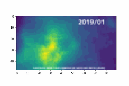
各月の二酸化窒素濃度を平均した画像も、L2データ時点より濃度の分布が保たれた画像となっていることがわかります。また、1月から3月にかけての冬の時期に濃度がより高くなっているがあらためてよくわかります。
またipygeeというライブラリを使うと、Google Earth Engineから取得した衛星データをPandas.DataFrameに変換することができます。こちらのライブラリを用いて、2019年初頭から2020年末にかけての2年間の二酸化炭素濃度の推移をグラフにしてみました。また、参考までに冒頭の港区・一の橋の2018年、2019年のデータを右に並べてみました。
chart = ipygee.chart.Image.seriesByRegion(**{
    'imageCollection': dataset,
    'reducer': ee.Reducer.sum(),
    'regions': fc,
    'scale': 1000
})

no2= chart.dataframe
no2.columns = ['no2']
no2.head()

no2_mean_by_month =  no2.resample('M').mean()
no2_mean_by_month['month'] = no2_mean_by_month.index.month
no2_mean_2019 = no2_mean_by_month[no2_mean_by_month.index.year == 2019]
no2_mean_2019 = no2_mean_2019.set_index('month')
no2_mean_2020 = no2_mean_by_month[no2_mean_by_month.index.year == 2020]
no2_mean_2020 = no2_mean_2020.set_index('month')

all = pd.read_csv('minatoku.csv')
data = all.query('地区 == "一の橋"').set_index('ymd')
monthly = data.groupby(['year', 'month']).mean().rename(columns={'二酸化窒素[ppb]': 'no2'})[['no2']]


plt.figure(figsize=(20, 5))
ax1 = plt.subplot(1, 2, 1)
no2_mean_2019[['no2']].rename(columns={'no2': 'no2 (2019)'}).plot(ax=ax1)
no2_mean_2020[['no2']].rename(columns={'no2': 'no2 (2020)'}).plot(ax=ax1)

ax2 = plt.subplot(1, 2, 2)
monthly.loc[2018][['no2']].rename(columns={'no2': 'no2 (2018)'}).plot(ax=ax2)
monthly.loc[2019][['no2']].rename(columns={'no2': 'no2 (2019)'}).plot(ax=ax2)
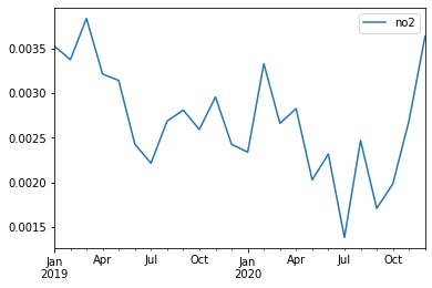
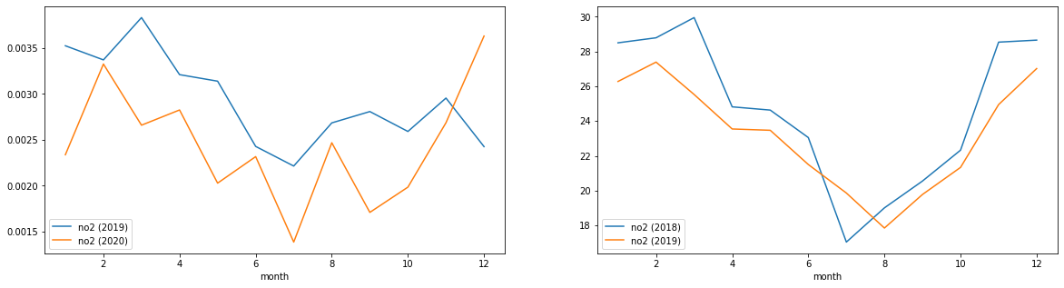
このグラフをみる限り、2019年の夏頃よりも、2020年の夏頃の方が落ち込みが大きいように見えます。先ほどのL2データによる可視化ではあまりわかりませんでしたが、これをみる限りはコロナ禍における自粛は、大気中の二酸化窒素濃度に何らかの影響を及ぼしていたと言えそうです。
冒頭の神奈川県ホームページの記述にあったように、今回対象とした大気汚染物質の排出要因が自動車の交通量や事業所での暖房機器によるものなのだとしたら、新型コロナウィルスによる生活様式の変化は大気汚染物質の排出量に影響があったと言えそうです。例えば、在宅ワークの浸透は、自動車交通による大気汚染物質の減少に寄与していそうです。この辺りは自動車交通量のデータなどと合わせて考察してみると、より確かな知見がえられるかもしれません。
6.まとめ
今回はSentinel-5Pの観測データを使って、大気汚染物質(一酸化炭素と二酸化窒素)の年間推移を確認してみました。一般的に言われているように夏場には低下し冬場に増加していることが確認できました。しかし、意外と高い値を記録している月もあり、必ずしもそのようになっていない月もありました。この辺りはデータの加工方法を工夫したり、元データの値を検証することでまた違う結果が得られるかもしれません。
また、2019年と2020年を比較し、新型コロナウィルスによる生活様式の変化が汚染物質の排出量に影響を与えているかを検証してみました。L2データを使った解析では大気汚染物質の排出量における明らかな影響を確認することはできませんでしたが、L3データを用いてグラフ化をおこなったことにより、各年の夏頃の二酸化窒素濃度に新型コロナウィルス下の影響があったように思われる傾向がみられました。
今回は直近の年度のデータを確認してみましたが、10年間のような長いスパンで大気汚染がどのように変化しているかを確認してみるのも面白いかもしれません。その場合はSentinel-5Pでは直近2年ほどのデータしか蓄積されていませんので、MODISなどの他の大気観測衛星のデータを利用してみると良いかもしれません。
Sentinel-5Pはこれから様々なデータが蓄積され、将来的に様々な分野で使われていくことと思われます。今回は地上データとして、大気の観測データと比較しましたが、その他の空間統計情報と組み合わせて解析してみるのもよいでしょう。