【コード付き】衛星画像を使って青森県の水田割合の変化を比較する~考察編~
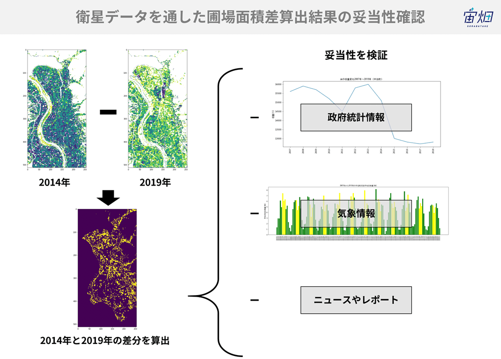
青森県中泊町の一部エリアの水田が2014年から2019年の間に10%減少していると衛星データによると分かりました。果たしてこの結果は実際の政府統計データと比較しても傾向は同じなのか、検証してみました。
記事作成時から、Tellusからデータを検索・取得するAPIが変更になっております。該当箇所のコードについては、以下のリンクをご参照ください。
https://www.tellusxdp.com/ja/howtouse/access/traveler_api_20220310_
firstpart.html
2022年8月31日以降、Tellus OSでのデータの閲覧方法など使い方が一部変更になっております。新しいTellus OSの基本操作は以下のリンクをご参照ください。
https://www.tellusxdp.com/ja/howtouse/tellus_os/start_tellus_os.html
衛星データを活用すれば「『青天の霹靂』に聞く!衛星データを用いた広大な稲作地帯の収穫時期予測」のように、美味しいお米作りにも役立てられる。
ただ、水田の把握ってどうやるの? ということで、実際に衛星データを活用すれば水田の有無が分かるのか、また、面積をどのように測るのかにチャレンジした「【コード付き】衛星画像を使って青森県の水田割合の変化を比較する~分析編~ 」。
青森県中泊町の一部エリアの水田が2014年から2019年の間に10%減少していると衛星データによると分かりました。果たしてこの結果は実際の政府統計データと比較しても傾向は同じなのか、検証してみました。
※TellusでJupyter Notebookを使う方法は、「Tellusの開発環境でAPI引っ張ってみた」をご覧ください。
(1)政府統計データを取得する
「pythonを使って青森県の水田割合を5年前と比較する~算出編~ 」は、あくまで衛星画像からの水田の変化を捉えたものでした。実際に水田で育つ米の収量は衛星画像のように減少をしているのでしょうか。これを調べるために、政府の統計情報を取得します。
米の収量データは、開発環境からe-StatのAPIを利用することで取得できます。さらに、得られたデータを表やグラフで表示し、衛星データで得られた結果がどれほど妥当であったのかを考察してみましょう。
検証にあたって、事前に、可視化ライブラリ(matplotlib)で日本語を使うため、最初に日本語フォントを開発環境で使えるように準備します。
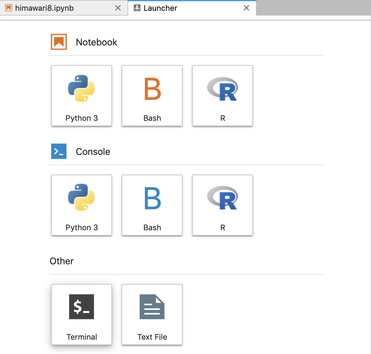
「Launcher」から「Other」の項目にある「Terminal」を選択します。
日本語フォントをダウンロードするには、Terminalから次のコマンドを実行してください。
cd ~/work; wget https://ipafont.ipa.go.jp/IPAfont/ipag00303.zip; unzip ipag00303.zip
※ipafontのダウンロードサイトのURLが変化すると、wgetは失敗します。その場合はipaフォントのサイトからipag00303.zipを直接ダウンロードしてください。ダウンロード後は/work以下に解凍したフォルダをアップロードしてください。
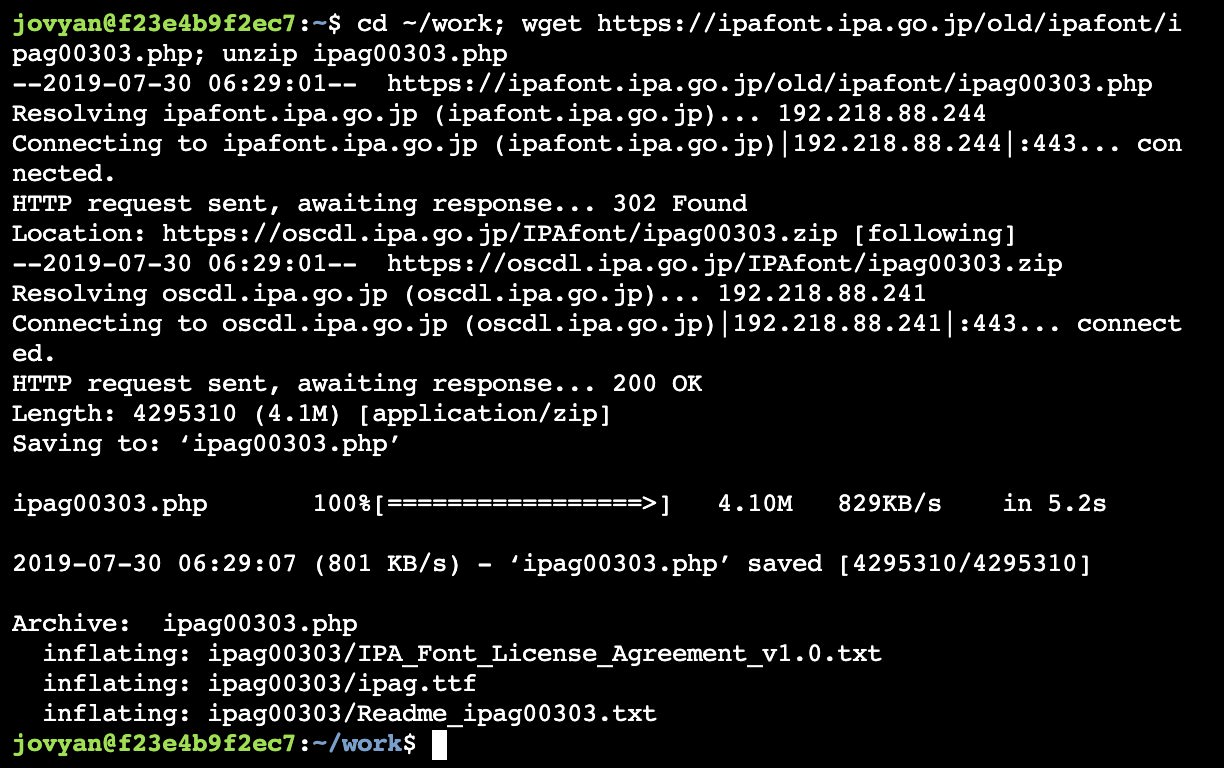
以上で日本語を使用する準備が完了しました。
次にe-Statを使う準備を始めます。e-StatではAPIを提供しており、利用規約に従って、データベースから様々な統計データを取得することができます。
ログインページをクリックし、ユーザー登録を済ませましょう。
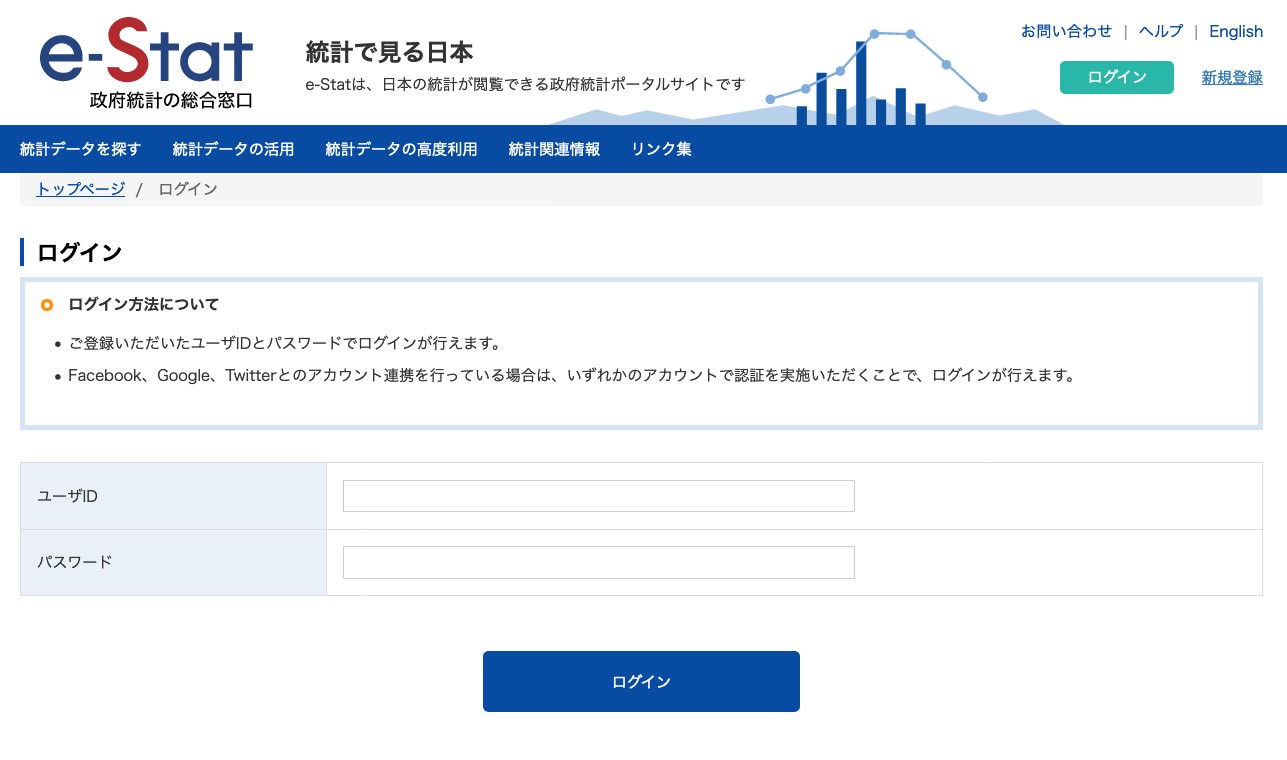
ユーザー登録ページは、このページの下部にあります。
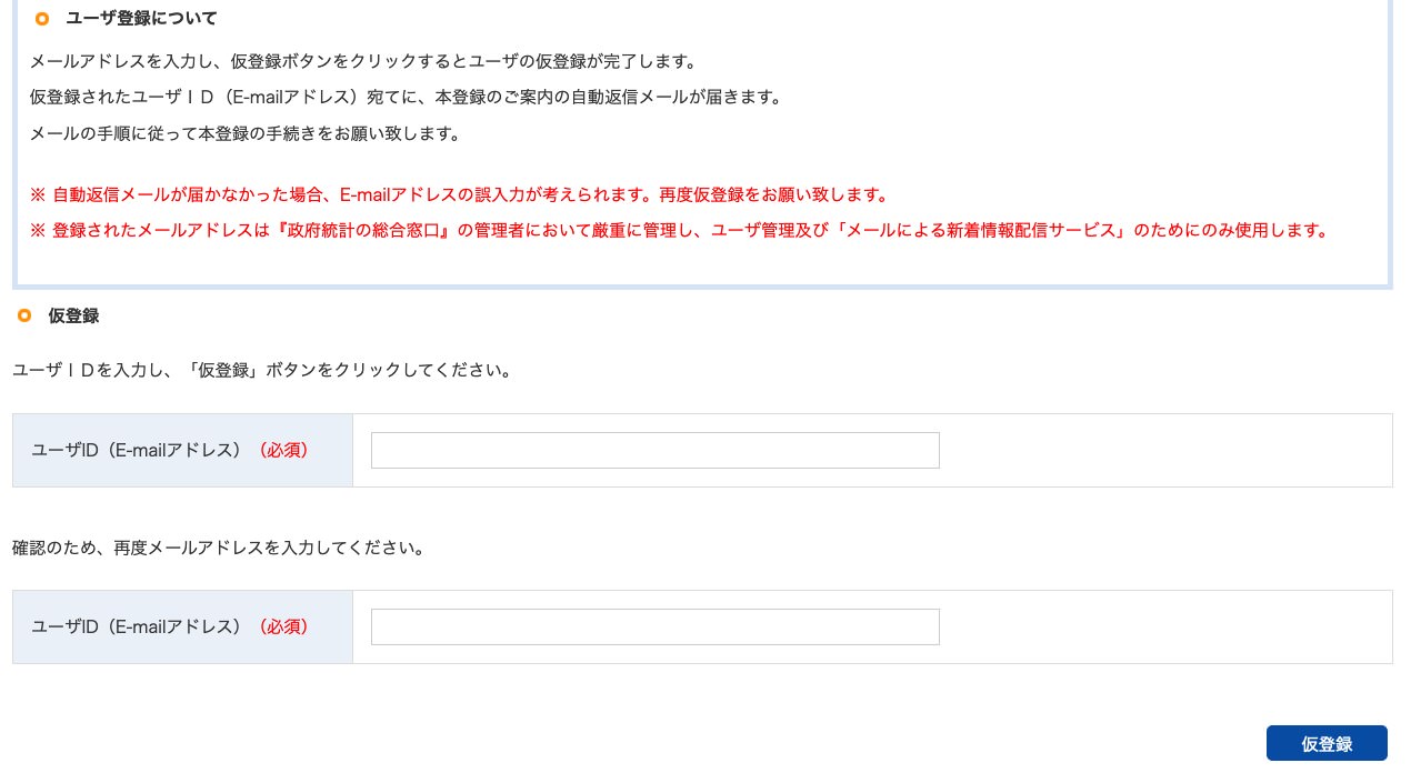
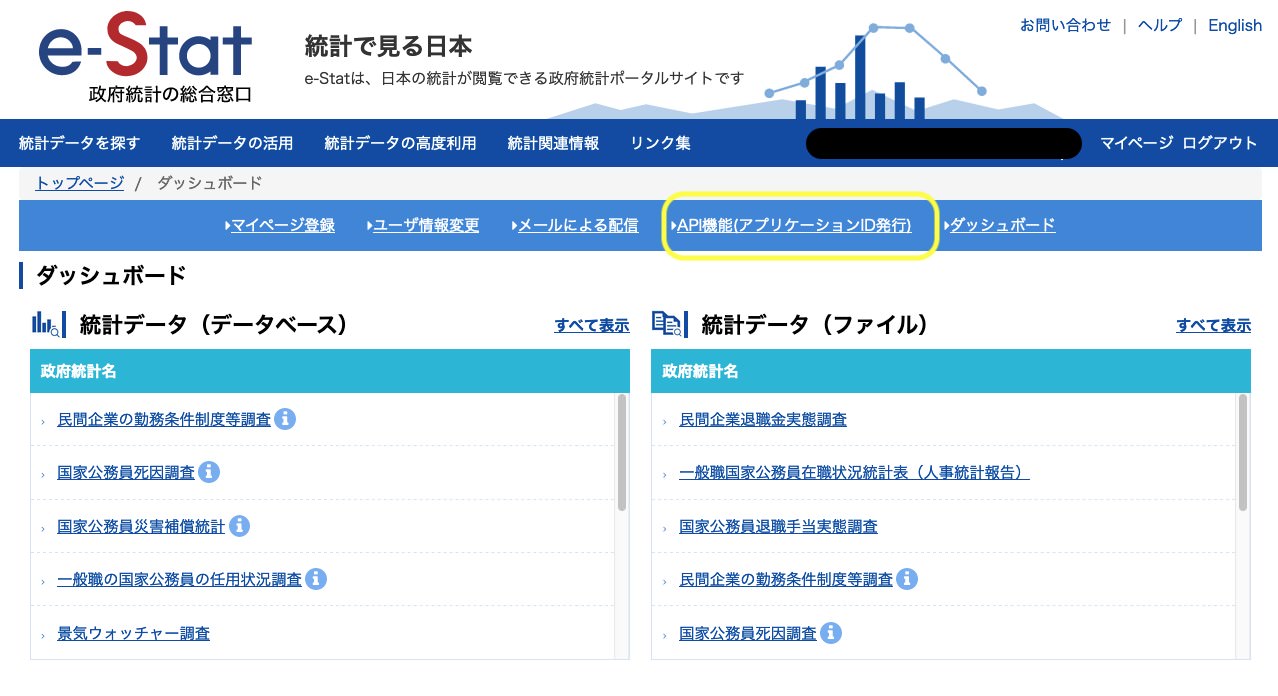
仮登録後、本登録をするためのメールが届きます。手順に従い空欄に記入をし、登録を完了してください。e-StatのAPIを利用するためには、アプリケーションIDを発行する必要があります。トップページからマイページをクリックしてください。API機能(アプリケーションID発行)を選択し、IDを発行します。
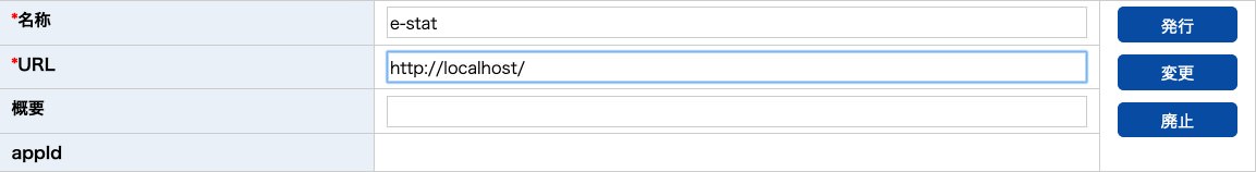
URLは”http://localhost/”と入力してください。これでe-StatのAPIを使用する準備が完了しました。実際にAPIを使用して作物統計調査のデータを取得しましょう。
import requests,urllib
import pandas as pd
import matplotlib.pyplot as plt
import numpy as np
def get_json(base_url,params):
params_str = urllib.parse.urlencode(params)
url = base_url + params_str
json = requests.get(url).json()
return json
def main():
appID = "ここに自分のアプリケーションIDを貼る"
base_url = "http://api.e-stat.go.jp/rest/2.1/app/json/getStatsData?"
params = {
"appId":appID,
"lang":"J",
"statsDataId":"0003293480",# e-Statで調べる
"metaGetFlg":"Y",
"cntGetFlg":"N",
"sectionHeaderFlg":"1"
}
json = get_json(base_url, params)
# valuesを探す
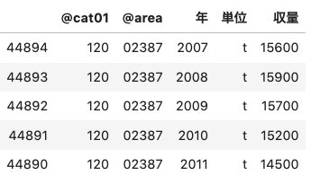
all_values = pd.DataFrame(json['GET_STATS_DATA']['STATISTICAL_DATA']['DATA_INF']['VALUE'])
# @cat01が120は収量(t) @areaは02387(中泊町)を指定
values = all_values[(all_values["@cat01"] == "120") & (all_values["@area"] == "02387")]
# 取得した時間の末尾に000000がつくので削除
values = values.replace("0{6}$", "", regex=True)
# 変数名を変更
values_df = values.rename(columns = {"@time": "年", "$": "収量","@unit": "単位"})
values_df = values_df.sort_values("年") # 年を基準に並べ替え
return values_df
(*このサービスは、政府統計総合窓口(e-Stat)のAPI機能を使用していますが、サービスの内容は国によって保証されたものではありません)
関数を実行して、e-Statから中泊町の米収量データを取得しましょう。
nakadomari = main()
nakadomari.head()
データが取得できました。次はmatplotlibを用いてグラフを描写してみましょう。
from pylab import *
from matplotlib import font_manager # 日本語をmatplotlibで使う
fontprop = matplotlib.font_manager.FontProperties(fname="/home/jovyan/work/ipag00303/ipag.ttf", size = 12) # フォントファイルの場所を指定
import seaborn as sns
import csv

# 変数がobjectなのでintに変換
nakadomari.loc[:,"年"] = nakadomari["年"].astype(int)
nakadomari.loc[:,"収量"] = nakadomari["収量"].astype(int)

x_range = range(len(hoge))
x_labels = nakadomari["年"]
y_range = nakadomari["収量"]
plt.figure(figsize = (14,6))
plt.plot(x_range, y_range)
plt.title('米の収量変化2007年〜2018年(中泊町)', fontdict = {"fontproperties": fontprop})
plt.xticks(x_range, x_labels, rotation='vertical')
plt.ylabel('収量(t)', fontdict = {"fontproperties": fontprop})
plt.show()
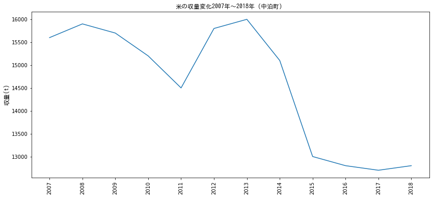
中泊町では2013年から2015年にかけて急激に米の収量が減少していることがわかります。2014年から2018年では、15,100トンから12,800トンへと減収しており、約1.5割の減収があったことが確認できました。
上記データは中泊町全体のデータであるため、衛星データで取得した水田よりも多くの水田が対象とはなっていますが、傾向値として減少しているということは確認することができました。
(2)なぜ米の収量が減ったのか、原因を探る
水田が減ったから米の収量が下がるという仮説の元、政府統計データを確認しましたが、収穫量減少の原因は耕作面積減少の他にも、気象要因が考えられます。気象庁から青森県市浦観測所のデータを取得して、気象要因についても調査しておきましょう。気象庁はAPIを配布していませんので、Pythonからスクレイピングでデータを入手します。
from bs4 import BeautifulSoup
import seaborn as sns
import csv

# 市浦(prec_no=31, block_no=1119)を取得。年、月の指定は任意
base_url = "http://www.data.jma.go.jp/obd/stats/etrn/view/daily_a1.php?prec_no=31&block_no=1119&year=%s&month=%s&day=&view="
(*出典:気象庁ホームページ)

# strをfloatへ
def str2float(str):
  try:
	return float(str)
  except:
	return 0.0


if __name__ == "__main__":
	var_list = [['年月日','降水量合計','時最大降水量','分最大降水量','平均気温','最高気温','最低気温',\
         	'平均風速','最大風速','最大風速風向','最大瞬間風速','最大瞬間風速風向','最多風向','日照時間','降雪','最深積雪']]
	# 2014年から2017年の範囲
	for year in range(2007,2019): # 期間の指定(年)
  	# print(year)
  	# 当該年の1月から12月
  	for month in range(1,13): # 月指定
    	# 年と月を当てはめる。
    	r = requests.get(base_url%(year, month))
    	r.encoding = r.apparent_encoding

    	# テーブルを取得
    	soup = BeautifulSoup(r.text)
    	rows = soup.findAll('tr',class_='mtx') #タグ指定、クラス指定

    	# 表の最初の1から3行目をスライス
    	rows = rows[3:]
    	# 全ての行を読み込む(日データ取得)
    	for row in rows:
        	row_vals = row.findAll('td')
        	rowData = [] #初期化
        	rowData.append(str(year) + "/" + str(month) + "/" + str(row_vals[0].string))
        	for i in range(15): # 15 variables are required
            	rowData.append(str2float(row_vals[i+1].string))
        	var_list.append(rowData)
取得したデータをcsvにして開発環境に保存します。
# csvとして保存
with open('Ichiura.csv', 'w') as file:
	writer = csv.writer(file, lineterminator='\n')
	writer.writerows(var_list)
保存したcsvからpandasデータフレームを作成します。
## csvからデータフレームを作成
ichiura = pd.read_csv('Ichiura.csv', sep=',')
ichiura.head()
月別データを作成するために、年月日のデータを年月、年、月、日の変数に分け、新しいデータフレームとして保存します。次いで、新しいデータフレームと既存のデータフレームを結合します。
ichiura_date = ichiura.iloc[:,0]
ichiura_date
df_date = pd.DataFrame({'ColumnName':ichiura_date})
df_date['ColumnName']= pd.to_datetime(df_date['ColumnName'])
df_date2 = pd.DataFrame(df_date.ColumnName.dt.strftime('%Y%m-%Y-%m-%d').str.split('-').tolist(),columns=['Year_Month','Year','Month','Day'],dtype=int)
df_date2

# 二つのデータフレームを結合
ichiura2 = pd.concat((ichiura,df_date2),axis=1)
ichiura2.head()
次に、月別の平均日照時間を計算します。
# 月別の平均日照時間を計算
# as_index = Falseで、集計のベースを変数として残す
mean_sunlight = ichiura2.groupby(['Year_Month'],as_index=False).agg({"日照時間":"mean"})
# 月のデータを加える
d_month = mean_sunlight['Year_Month'].str.replace("\d{4}"," ")
month_df = pd.DataFrame(d_month,dtype=object)
month_df.rename(columns={'Year_Month':'Month'}, inplace=True)
# 新しいデータフレーム作成
mean_sunlight2 = pd.concat((mean_sunlight,month_df),axis=1)
mean_sunlight2.head()
これでグラフを描く準備ができました。可視化モジュールを使い、実際に描画してみましょう。
x_range = range(len(mean_sunlight2))
x_labels = mean_sunlight2['Year_Month']
y_sunshine = mean_sunlight2['日照時間']
plt.figure(figsize = (22,6))

# 7月と8月をハイライト
bar_list = plt.bar(x_range, y_sunshine, color='green', align='center')
i = 0
while i < 12:
	bar_list[6+12*i].set_color('yellow')
	bar_list[7+12*i].set_color('yellow')
	i += 1

plt.title('2007年から2018年の中泊町月別平均日射量(時)', fontdict = {"fontproperties": fontprop})
plt.xticks(x_range, x_labels, rotation='vertical')
# ticksの調整
plt.tick_params(axis='x', which='major', labelsize=8)
plt.ylabel('平均月別日照量(時)', fontdict = {"fontproperties": fontprop})
plt.show()
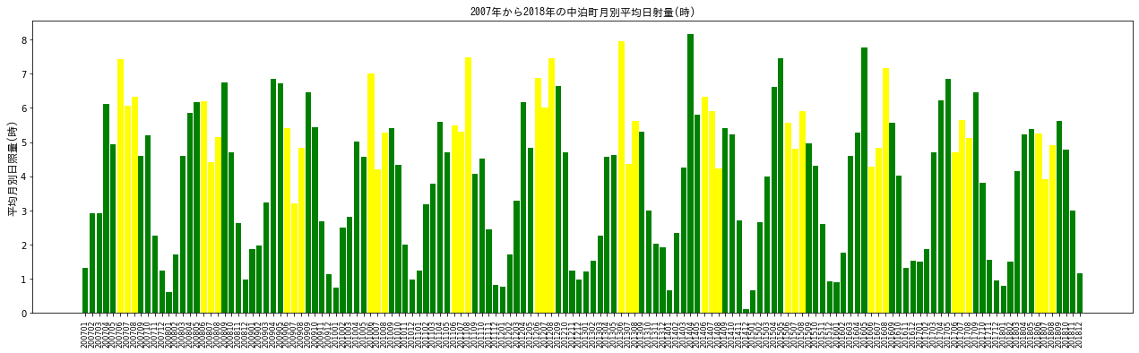
x軸が見にくいですが、2007年1月から2018年12月までのデータが示されています。6月、7月、8月を黄色でハイライトしています。中泊町では田植えの開始時期が5月中旬から下旬に集中しています。出穂は8月の1週目になりますので、6月から8月までの日照は稲の生育に重要と考えられます。加えて、降水量も調べてみましょう。
# 月別の降水量を計算
# as_index = Falseで、集計のベースを変数として残す
sum_prec = ichiura2.groupby(['Year_Month'],as_index=False).agg({"降水量合計":"sum"})
sum_prec2 = pd.concat((sum_prec,month_df),axis=1)

x_range = range(len(sum_prec2))
x_labels = sum_prec2['Year_Month']
y_prec = sum_prec2['降水量合計']
plt.figure(figsize = (22,6))

# 7月と8月をハイライト
bar_list = plt.bar(x_range, y_prec, color='green', align='center')
i = 0
while i < 12:
	bar_list[5+12*i].set_color('yellow')
	bar_list[6+12*i].set_color('yellow')
	bar_list[7+12*i].set_color('yellow')
	i += 1
plt.title('2007年から2018年の中泊町月別降水量合計(mm)', fontdict = {"fontproperties": fontprop})
plt.xticks(x_range, x_labels, rotation='vertical')
# ticksの調整
plt.tick_params(axis='x', which='major', labelsize=8)
plt.ylabel('降水量合計(mm)', fontdict = {"fontproperties": fontprop})
plt.show()
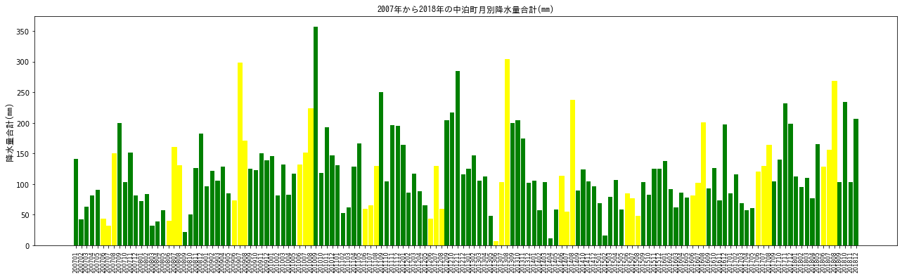
上記が降水量のグラフになります。
気象データは多少の増減はあるものの、一年を通してのパターンは一貫しているようです。日照時間であれば、冬場に少なく、春から夏へとかけて増加しており、降水量であれば、冬と夏にピークがあるというものです。
2018年は2014年に注目すると、2018年は2014年と比べて、降水量が多く、日照量が少ないことが見て取れます。
しかし、気象データのみで、収量の減少の原因を捉えることは難しそうです(厳密には、収量が気象データによってどのように変化するのかを統計モデルにより考えることもできます。機械学習で収量の予測モデルを作成することもできるでしょう)。
(3)考察
結果、気象データにおいて、検討を行うに十分なデータを得ることはできませんでしたが、どうやら中泊町は水稲単一経営が多い地域でしたが 、米の消費が下がる中で、野菜や花卉などを合わせて行う複合経営が見られるようになったようです。このような流れの中で、一部の水田は畑地へと転換されてしまったのかもしれません。
また、複合経営は労力がかかり、高齢の農業従事者には経営が難しいという欠点を抱えており、中泊町では若手人材の育成に積極的に取り組んでいます。2013年には「ばろかだる会」という若手経営者で構成される組織が出来上がり、奇しくも、米の収量減少時期と重なっています。
以上、米の収量減少における、はっきりとした因果関係はさておき、衛星画像から米収量の低下を見積ることができたことで、当初掲げていた「衛星データを活用すれば水田の有無が分かるのか、また、面積をどのように測るのか」という目的はある程度達成できたと言えるのではないでしょうか。
蛇足ではありますが、光学画像では雲の多い撮影シーンを利用できないなどの制限もあります。雲に対する解決策としては、SAR画像を用いることが考えられます。実際、雲の多い東南アジア地域の水田(圃場)面積を算出する際に、SAR画像は良く用いられています。特定時期に水を張る水田は、SAR画像で検出しやすいためです。
また、さらに高い精度で水田を抽出するためには機械学習を用いる、現地データも利用することも可能です。収量の予測モデルを立てるのであれば、複数の変数を様々なデータベースから取得して、妥当なモデルを勘案することまでもできるでしょう。
いずれにしても、地上での変化を衛星データから簡易的に定量できるということは、非常に魅力的なことです。ぜひみなさんもAPIを活用し、Tellusの開発環境内で様々なデータ解析を行ってみませんか?
今回利用したスクリプトです。
import os, json, requests, math, glob, re
import numpy as np
from skimage import io
from io import BytesIO
import dateutil.parser
from datetime import datetime
from datetime import timezone
import matplotlib.pyplot as plt
%matplotlib inline

TOKEN = "自身のAPIキーを貼り付けてください"

def get_landsat_scene(min_lat, min_lon, max_lat, max_lon):
	"""Landsat8のメタデータを取得します"""
	url = "https://gisapi.tellusxdp.com/api/v1/landsat8/scene" \
    	+ "?min_lat={}&min_lon={}&max_lat={}&max_lon={}".format(min_lat, min_lon, max_lat, max_lon)
	headers = {
    	"Authorization": "Bearer " + TOKEN
	}

	r = requests.get(url, headers=headers)
	return r.json()


# 弘前周辺
scenes = get_landsat_scene(40.49, 140.502, 40.744, 140.797)
# {\min_lat\:40.49,\min_lon\:140.502,\max_lat\:40.744,\max_lon\:140.797}
print(len(scenes))


def filter_by_date(scenes, start_date=None, end_date=None):
    	"""衛星の撮影時間を基にしてメタデータを抽出する"""
    	if(start_date == None):
        	start_date = datetime(1900,1,1, tzinfo=timezone.utc) # tellusにあるlandsat8のデータは2013年以降から現在まで
    	if(end_date == None):
        	end_date = datetime.now(timezone.utc) # 現在の時間をデフォルトで取得する
    	return [scene for scene in scenes if start_date  dateutil.parser.parse(scene["acquisitionDate"])]

landsat_scenes = filter_by_date(scenes, datetime(2014, 1, 1, tzinfo=timezone.utc), datetime(2019, 6, 1, tzinfo=timezone.utc))


ext_date = [re.search(r'\d{2} [A-z]{3} \d{4}',ext_date['acquisitionDate']) for ext_date in landsat_scenes]


# サムネイル画像を取得
thumbs_landsat = [imgs['thumbs_url'] for imgs in landsat_scenes]


def get_tile_images(thumbs, r_num, c_num, figsize_x=12, figsize_y=12):
    	"""サムネイル画像を指定した引数に応じて行列状に表示"""
    	blank = []
    	count = []
    	match = []
    	D_M_Y = []
    	f, ax_list = plt.subplots(r_num, c_num, figsize=(figsize_x,figsize_y))
    	for row_num, ax_row in enumerate(ax_list):
        	for col_num, ax in enumerate(ax_row):
            	if len(thumbs) < r_num*c_num:
                	len_shortage = r_num*c_num - len(thumbs) # 行列の不足分を算出
                	count = row_num * c_num + col_num
                	if count  min_val) & \
                        	(stack_img  0.01) & (Apr2014_land_ndvi_wb_stack  0.01) & (Apr2019_land_ndvi_wb_stack  0), 0, 1)
	for i in range(1,len(ims)):
    	mask += np.where((ims[i] > 0), 0, 1)

	return np.where((mask > 0), 0, 1).astype(np.uint8)


bbox = get_tile_bbox(12, 3645, 1535, 1, 2)
px_size = {'width': Apr2019_land_ndvi_wb_stack.shape[1], 'height': Apr2019_land_ndvi_wb_stack.shape[0]}

nakadomari_features_mask = get_mask_image(nakadomari_features, bbox, px_size)
plt.figure(figsize = (6,12))
io.imshow(nakadomari_features_mask)


Apr2014_mask_img = np.where(nakadomari_features_mask != 1, Apr2014_land_ndvi_wb_stack, 0)
plt.figure(figsize = (6,12))
plt.imshow(Apr2014_mask_img)
plt.colorbar()


with np.errstate(invalid='ignore'):
	Apr2014_mask_img_sum =  np.where((Apr2014_mask_img > 0.01) & (Apr2014_mask_img  0.01) & (Apr2019_mask_img < 0.08), 1, 0)
sum(Apr2019_mask_img_sum.flatten())/len(Apr2019_mask_img_sum.flatten())
# Around 30% is paddy fields in Nakadomari-machi


# 2014年と2019年の差分画像を作成する
diff_ndvi = Apr2014_mask_img_sum - Apr2019_mask_img_sum
# 2019年では水田でなくなった部分を抽出
diff_ndvi_ext = np.where(diff_ndvi==1,1,0)
plt.figure(figsize = (6,12))
plt.imshow(diff_ndvi_ext)


import requests,urllib
import pandas as pd
import matplotlib.pyplot as plt
import numpy as np

def get_json(base_url,params):
	params_str = urllib.parse.urlencode(params)
	url = base_url + params_str
	json = requests.get(url).json()
	return json

def main():
	appID = "ここに自分のアプリケーションIDを貼る"
	base_url = "http://api.e-stat.go.jp/rest/2.1/app/json/getStatsData?"
	params = {
    	"appId":appID,
    	"lang":"J",
    	"statsDataId":"0003293480",# e-Statで調べる
    	"metaGetFlg":"Y",
    	"cntGetFlg":"N",
    	"sectionHeaderFlg":"1"
	}
	json = get_json(base_url, params)

	# valuesを探す
	all_values = pd.DataFrame(json['GET_STATS_DATA']['STATISTICAL_DATA']['DATA_INF']['VALUE'])
 	# @cat01が120は収量(t) @areaは02387(中泊町)を指定
	values = all_values[(all_values["@cat01"] == "120") & (all_values["@area"] == "02387")]
	# 取得した時間の末尾に000000がつくので削除
	values = values.replace("0{6}$", "", regex=True)
	# 変数名を変更
	values_df = values.rename(columns = {"@time": "年", "$": "収量","@unit": "単位"})
	values_df = values_df.sort_values("年") # 年を基準に並べ替え
	return values_df


関数を実行して、e-Statから中泊町の米収量データを取得しましょう。


nakadomari = main()
nkadomari.head()


nakadomari = main()
nakadomari.head()


from pylab import *
from matplotlib import font_manager # 日本語をmatplotlibで使う
fontprop = matplotlib.font_manager.FontProperties(fname="/home/jovyan/work/ipag00303/ipag.ttf", size = 12) # フォントファイルの場所を指定
import seaborn as sns
import csv

# 変数がobjectなのでintに変換
nakadomari.loc[:,"年"] = nakadomari["年"].astype(int)
nakadomari.loc[:,"収量"] = nakadomari["収量"].astype(int)

x_range = range(len(hoge))
x_labels = nakadomari["年"]
y_range = nakadomari["収量"]
plt.figure(figsize = (14,6))
plt.plot(x_range, y_range)
plt.title('米の収量変化2007年〜2018年(中泊町)', fontdict = {"fontproperties": fontprop})
plt.xticks(x_range, x_labels, rotation='vertical')
plt.ylabel('収量(t)', fontdict = {"fontproperties": fontprop})
plt.show()


# JMAから気象データを取得し、グラフで表示する
from bs4 import BeautifulSoup
import seaborn as sns
import csv

# 市浦(prec_no=31, block_no=1119)を取得。年の月の指定は任意
base_url = "http://www.data.jma.go.jp/obd/stats/etrn/view/daily_a1.php?prec_no=31&block_no=1119&year=%s&month=%s&day=&view="


# strをfloatへ
def str2float(str):
  try:
	return float(str)
  except:
	return 0.0


if __name__ == "__main__":
	var_list = [['年月日','降水量合計','時最大降水量','分最大降水量','平均気温','最高気温','最低気温',\
         	'平均風速','最大風速','最大風速風向','最大瞬間風速','最大瞬間風速風向','最多風向','日照時間','降雪','最深積雪']]
	# 2014年から2017年の範囲
	for year in range(2007,2019): # 期間の指定(年)
  	# print(year)
  	# 当該年の1月から12月
  	for month in range(1,13): # 月指定
    	# 年と月を当てはめる。
    	r = requests.get(base_url%(year, month))
    	r.encoding = r.apparent_encoding

    	# テーブルを取得
    	soup = BeautifulSoup(r.text)
    	rows = soup.findAll('tr',class_='mtx') #タグ指定、クラス指定

    	# 表の最初の1から3行目をスライス
    	rows = rows[3:]
    	# 全ての行を読み込む(日データ取得)
    	for row in rows:
        	row_vals = row.findAll('td')
        	rowData = [] #初期化
        	rowData.append(str(year) + "/" + str(month) + "/" + str(row_vals[0].string))
        	for i in range(15): # 15 variables are required
            	rowData.append(str2float(row_vals[i+1].string))
        	var_list.append(rowData)


# csvとして保存
with open('Ichiura.csv', 'w') as file:
	writer = csv.writer(file, lineterminator='\n')
	writer.writerows(var_list)

## csvからデータフレームを作成
ichiura = pd.read_csv('Ichiura.csv', sep=',')
ichiura.head()


ichiura_date = ichiura.iloc[:,0]
ichiura_date
df_date = pd.DataFrame({'ColumnName':ichiura_date})
df_date['ColumnName']= pd.to_datetime(df_date['ColumnName'])
df_date2 = pd.DataFrame(df_date.ColumnName.dt.strftime('%Y%m-%Y-%m-%d').str.split('-').tolist(),columns=['Year_Month','Year','Month','Day'],dtype=int)
df_date2

ichiura2 = pd.concat((ichiura,df_date2),axis=1)
ichiura2.head()


# 月別の平均日照時間を計算
# as_index = Falseで、集計のベースを変数として残す
mean_sunlight = ichiura2.groupby(['Year_Month'],as_index=False).agg({"日照時間":"mean"})
# 月のデータを加える
d_month = mean_sunlight['Year_Month'].str.replace("\d{4}"," ")
month_df = pd.DataFrame(d_month,dtype=object)
month_df.rename(columns={'Year_Month':'Month'}, inplace=True)
# 新しいデータフレーム作成
mean_sunlight2 = pd.concat((mean_sunlight,month_df),axis=1)
mean_sunlight2.head()


x_range = range(len(mean_sunlight2))
x_labels = mean_sunlight2['Year_Month']
y_sunshine = mean_sunlight2['日照時間']
plt.figure(figsize = (22,6))

# 7月と8月をハイライト
bar_list = plt.bar(x_range, y_sunshine, color='green', align='center')
i = 0
while i < 12:
	bar_list[6+12*i].set_color('yellow')
	bar_list[7+12*i].set_color('yellow')
	i += 1

plt.title('2007年から2018年の中泊町月別平均日射量(時)', fontdict = {"fontproperties": fontprop})
plt.xticks(x_range, x_labels, rotation='vertical')
# ticksの調整
plt.tick_params(axis='x', which='major', labelsize=8)
plt.ylabel('平均月別日照量(時)', fontdict = {"fontproperties": fontprop})
plt.show()


# 月別の降水量を計算
# as_index = Falseで、集計のベースを変数として残す
sum_prec = ichiura2.groupby(['Year_Month'],as_index=False).agg({"降水量合計":"sum"})
sum_prec2 = pd.concat((sum_prec,month_df),axis=1)

x_range = range(len(sum_prec2))
x_labels = sum_prec2['Year_Month']
y_prec = sum_prec2['降水量合計']
plt.figure(figsize = (22,6))

# 7月と8月をハイライト
bar_list = plt.bar(x_range, y_prec, color='green', align='center')
i = 0
while i < 12:
	bar_list[5+12*i].set_color('yellow')
	bar_list[6+12*i].set_color('yellow')
	bar_list[7+12*i].set_color('yellow')
	i += 1
plt.title('2007年から2018年の中泊町月別降水量合計(mm)', fontdict = {"fontproperties": fontprop})
plt.xticks(x_range, x_labels, rotation='vertical')
# ticksの調整
plt.tick_params(axis='x', which='major', labelsize=8)
plt.ylabel('降水量合計(mm)', fontdict = {"fontproperties": fontprop})
plt.show()